CHALLENGE:
Operating in the Belo Horizonte advertising market for 20 years, Tom Comunicação has always been labeled as a planning focused agency. Therefore, we had the challenge of showing the evolution of the agency, now focused on digital solutions and full service operations.
Operating in the Belo Horizonte advertising market for 20 years, Tom Comunicação has always been labeled as a planning focused agency. Therefore, we had the challenge of showing the evolution of the agency, now focused on digital solutions and full service operations.
STRATEGY:
To reposition itself as a strategic and highly creative agency, Tom needed a team of qualified professionals and an integrated operation mode that would provide an environment of increasingly brilliant and powerful ideas through a close, cool and surprising language. It was also necessary to regain the trust and admiration of the Minas Gerais and national advertising market, strengthen its attributes and prove itself innovative. Furthermore, it was necessary to define a clear, differentiated and proprietary positioning of the brand:
To reposition itself as a strategic and highly creative agency, Tom needed a team of qualified professionals and an integrated operation mode that would provide an environment of increasingly brilliant and powerful ideas through a close, cool and surprising language. It was also necessary to regain the trust and admiration of the Minas Gerais and national advertising market, strengthen its attributes and prove itself innovative. Furthermore, it was necessary to define a clear, differentiated and proprietary positioning of the brand:
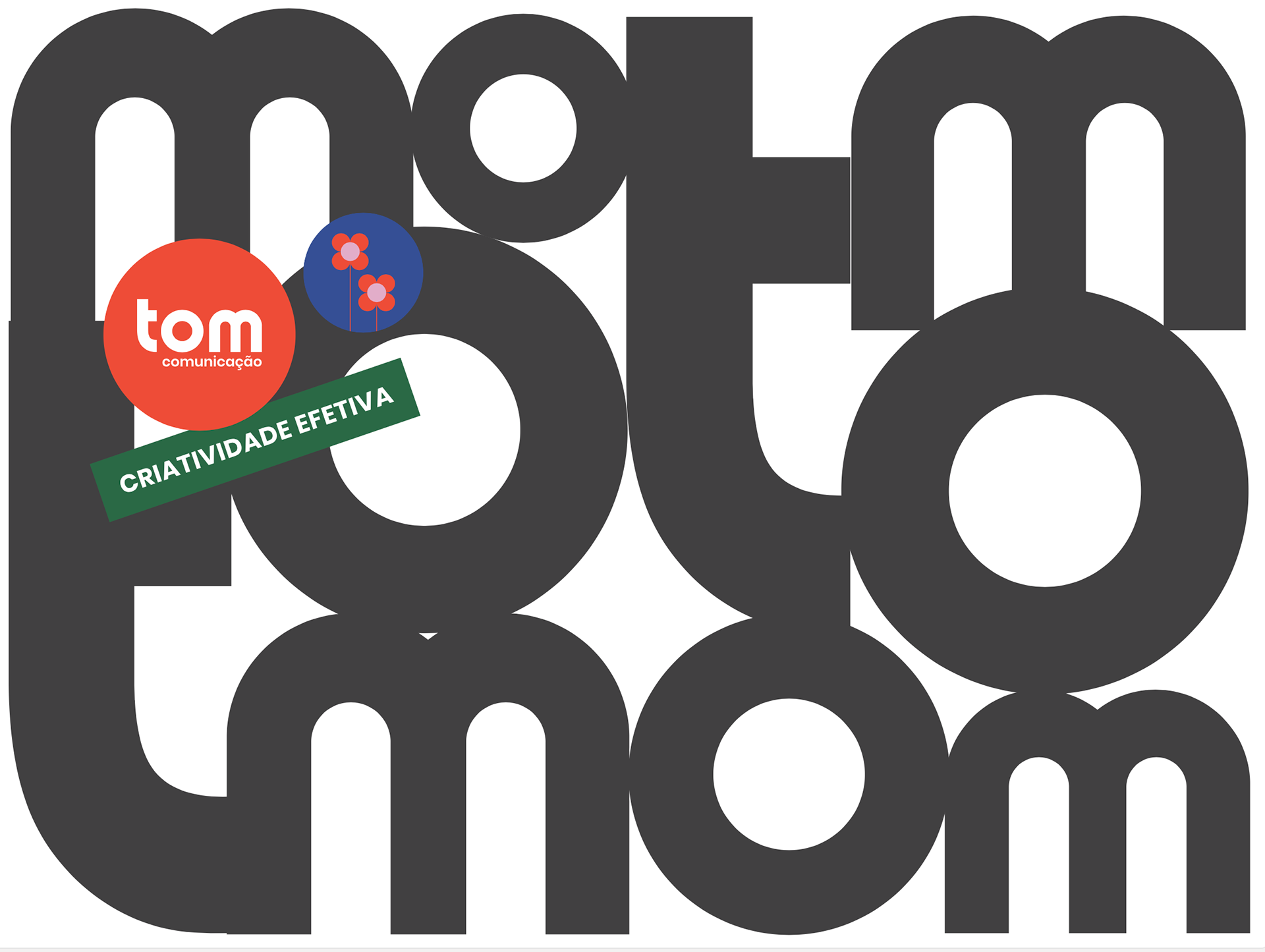
"Tom believes in the power of creativity to solve communication problems. To this end, it promotes a multiplicity of perspectives to create innovative results using strategy and technology without setting performance aside. This is effective creativity."
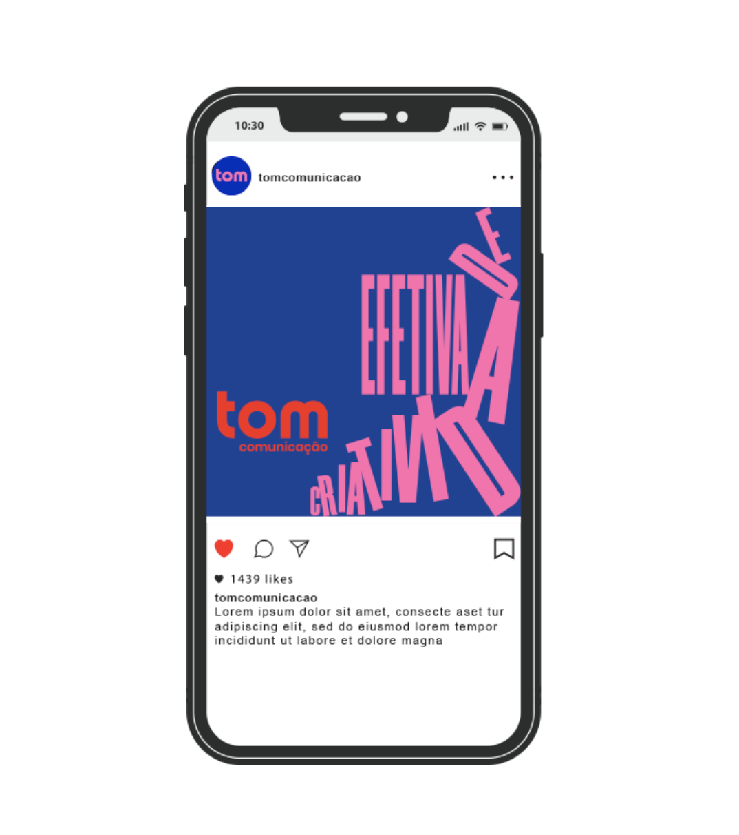
CREATION:
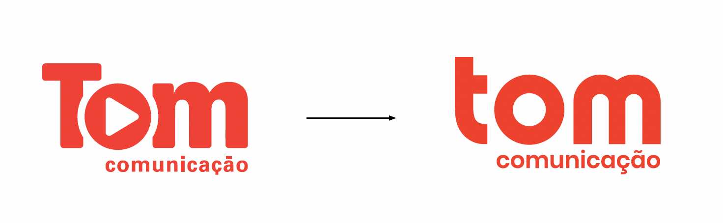
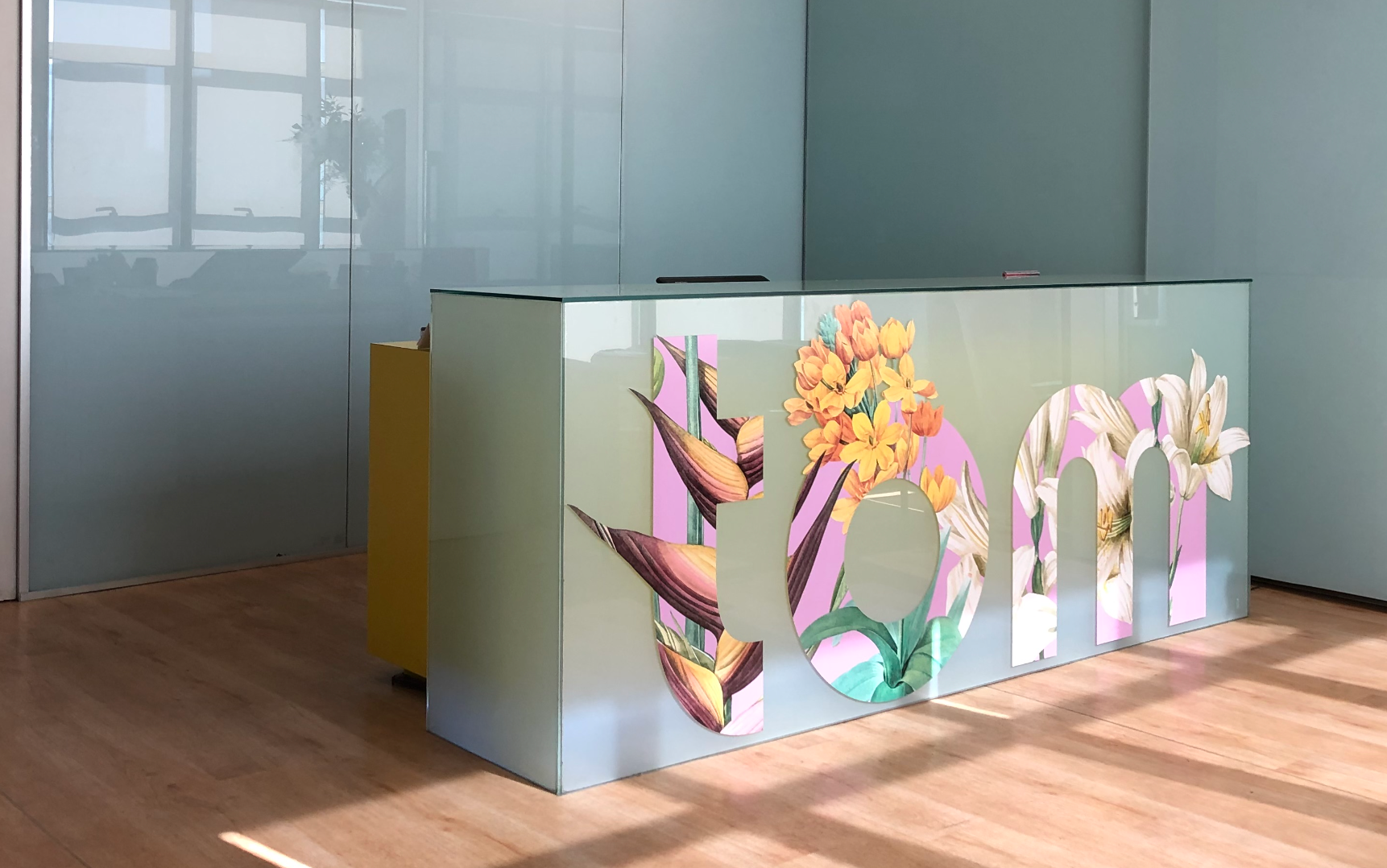
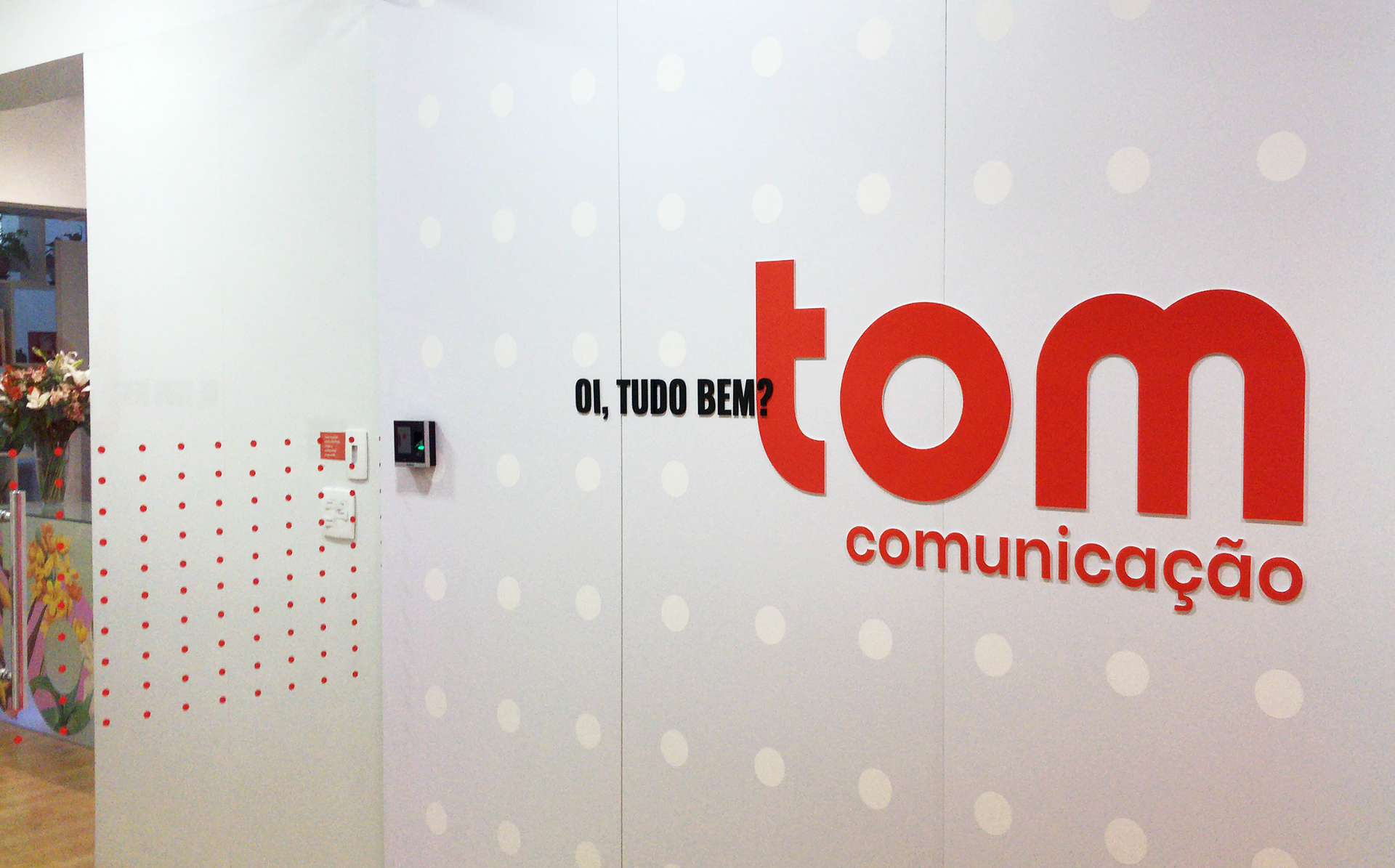
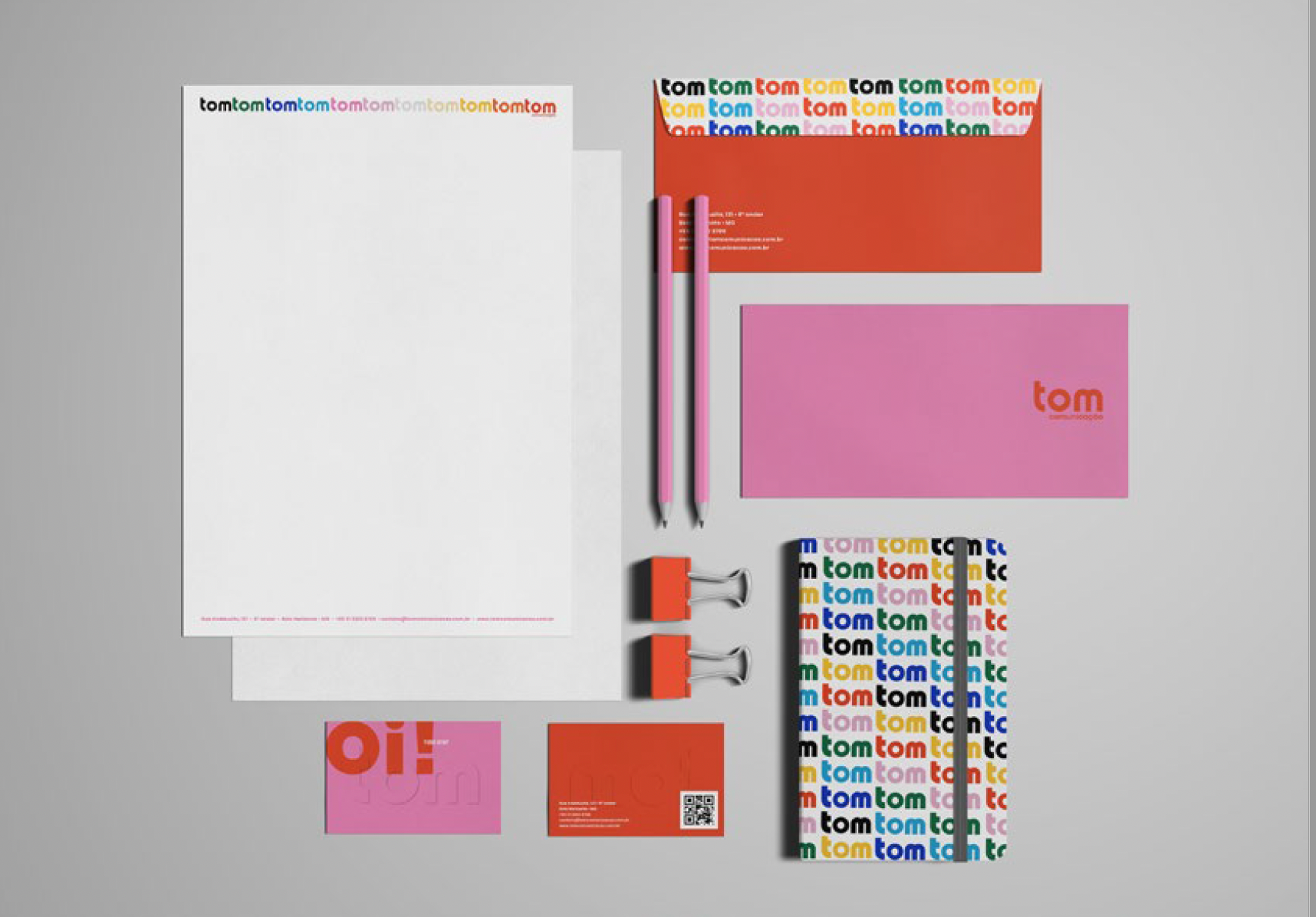
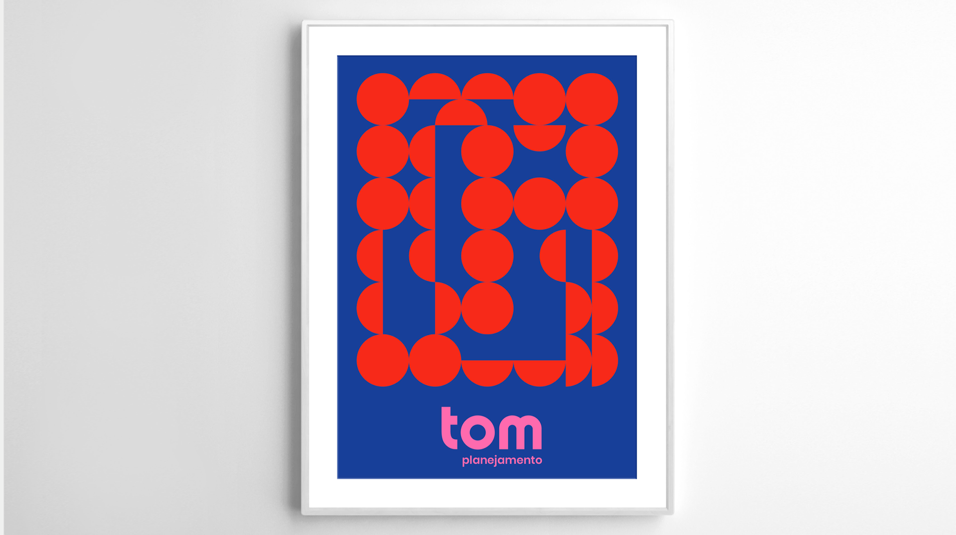
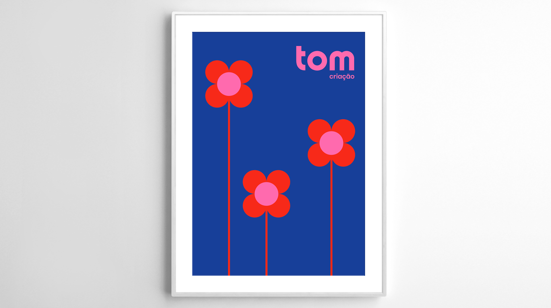
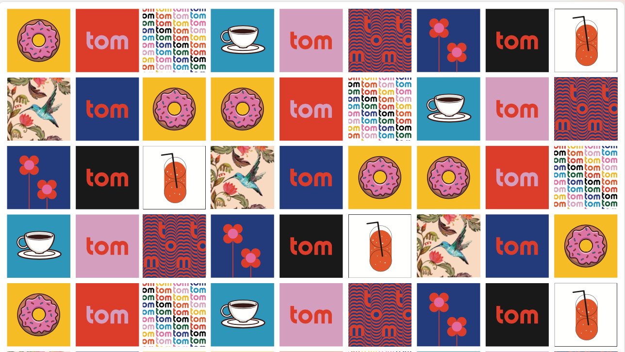
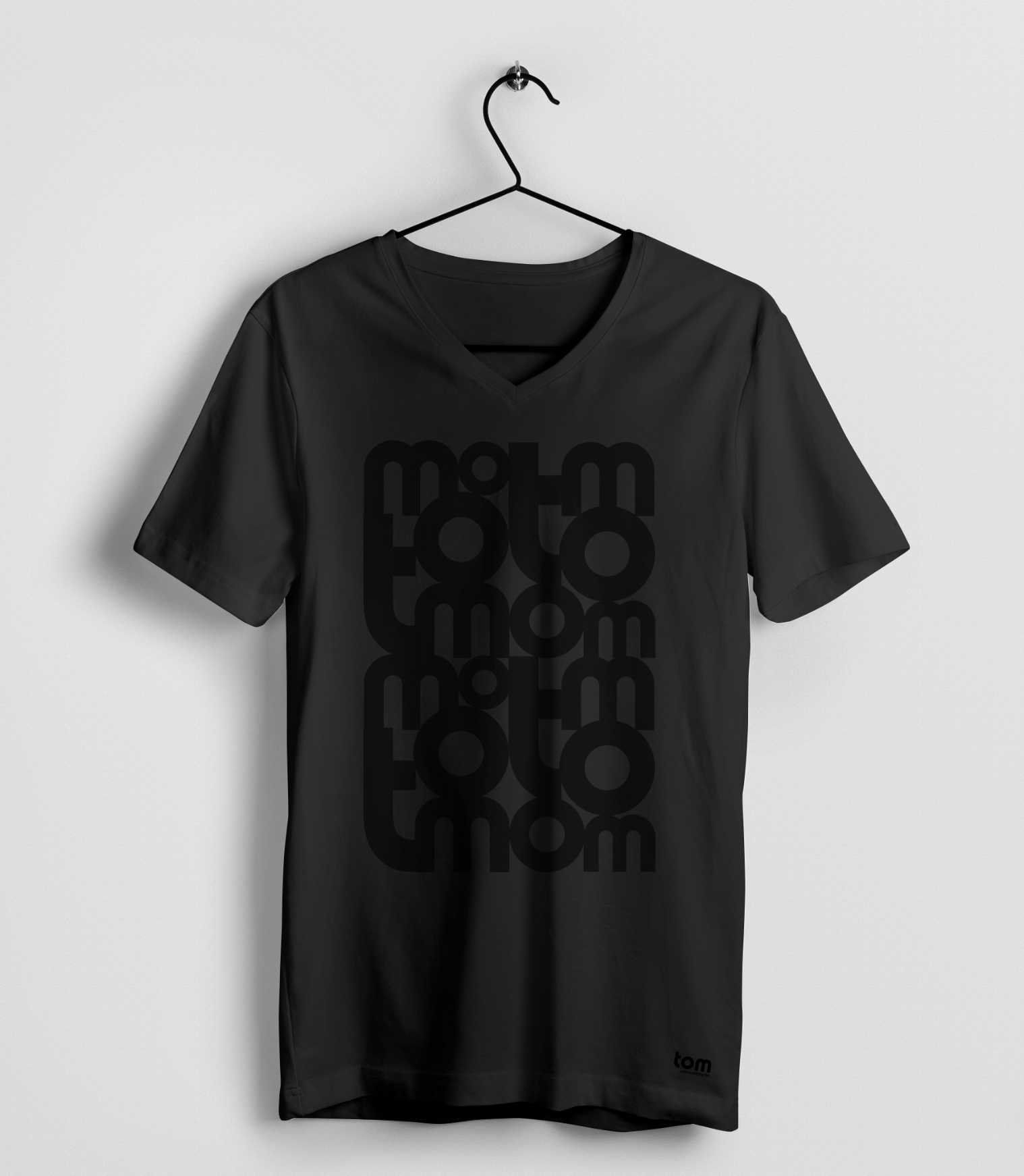
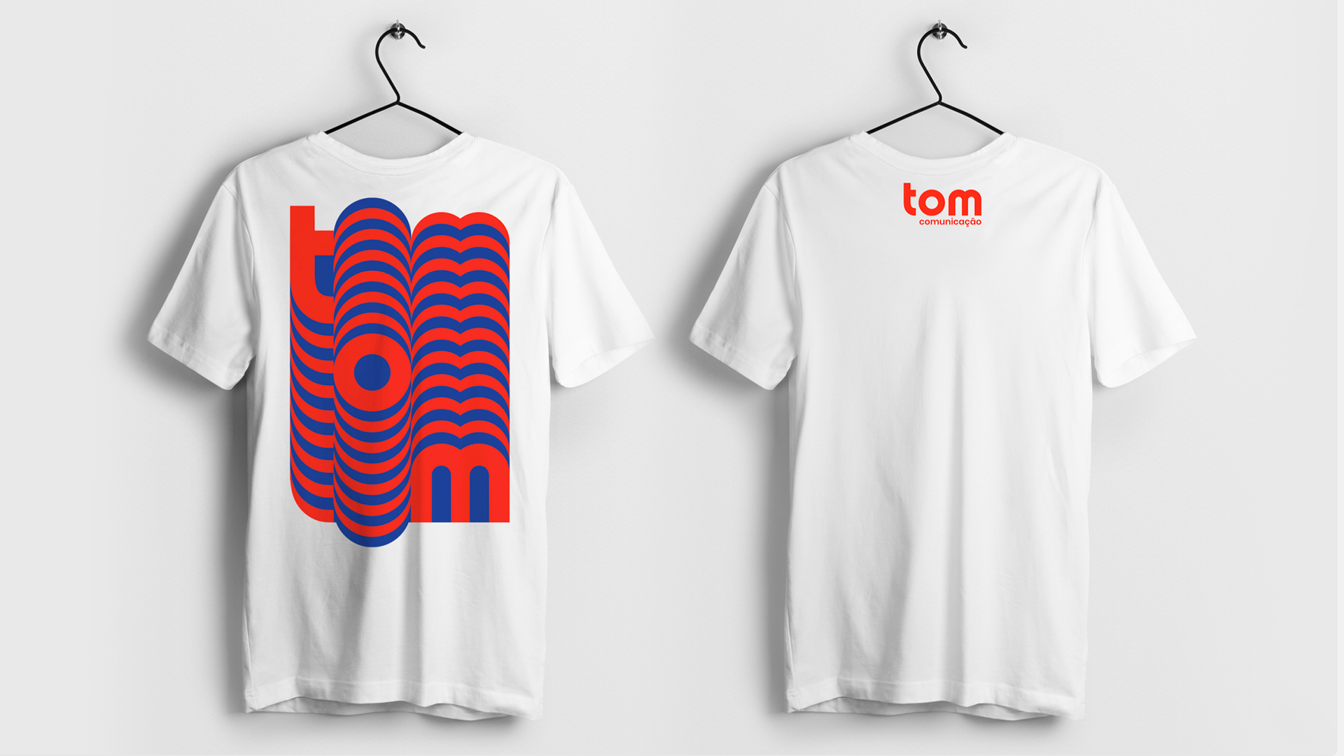
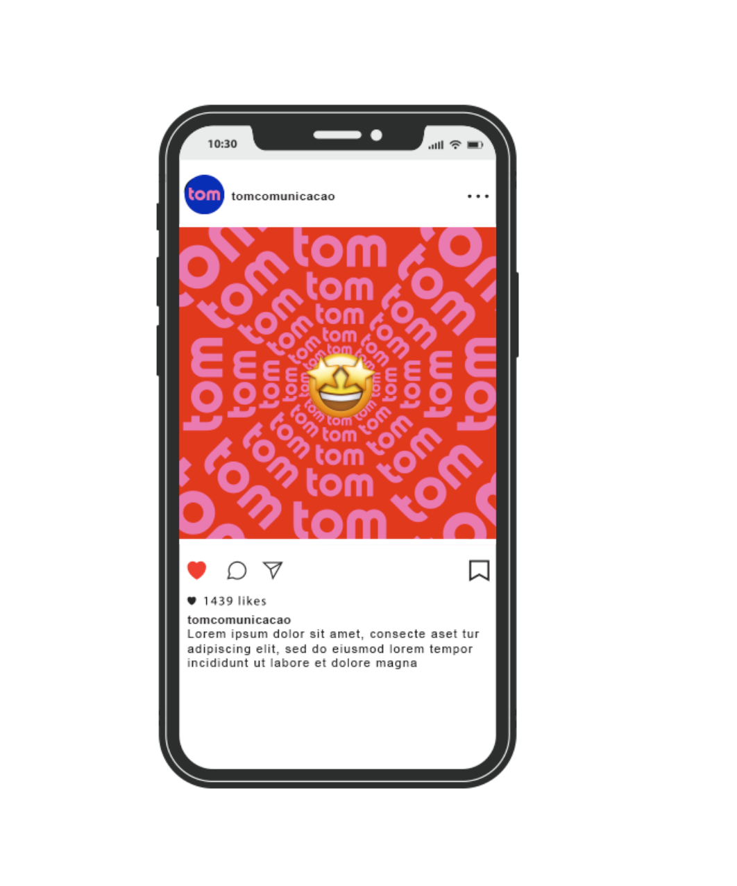
To follow the positioning, the new visual identity should be differentiated from the old one, both visually and verbally. The logo was built with strong typography, to make a statement and be a proprietary signature. Its shapes are protagonists in the construction of the entire visual identity, being applied in different colors, while exploring its full potential. This characteristic points to service diversity and also demonstrates freedom of expression. A logo must function alone, however, most of the time it is accompanied by visual identity. The effort is to ensure that it resembles the business, that it communicates authentically and appropriately, and is also engaged and creative. It was necessary to develop more than a logo, but a Tom brand.
To follow the positioning, the new visual identity should be differentiated from the old one, both visually and verbally. The logo was built with strong typography, to make a statement and be a proprietary signature. Its shapes are protagonists in the construction of the entire visual identity, being applied in different colors, while exploring its full potential. This characteristic points to service diversity and also demonstrates freedom of expression. A logo must function alone, however, most of the time it is accompanied by visual identity. The effort is to ensure that it resembles the business, that it communicates authentically and appropriately, and is also engaged and creative. It was necessary to develop more than a logo, but a Tom brand.


Premisses
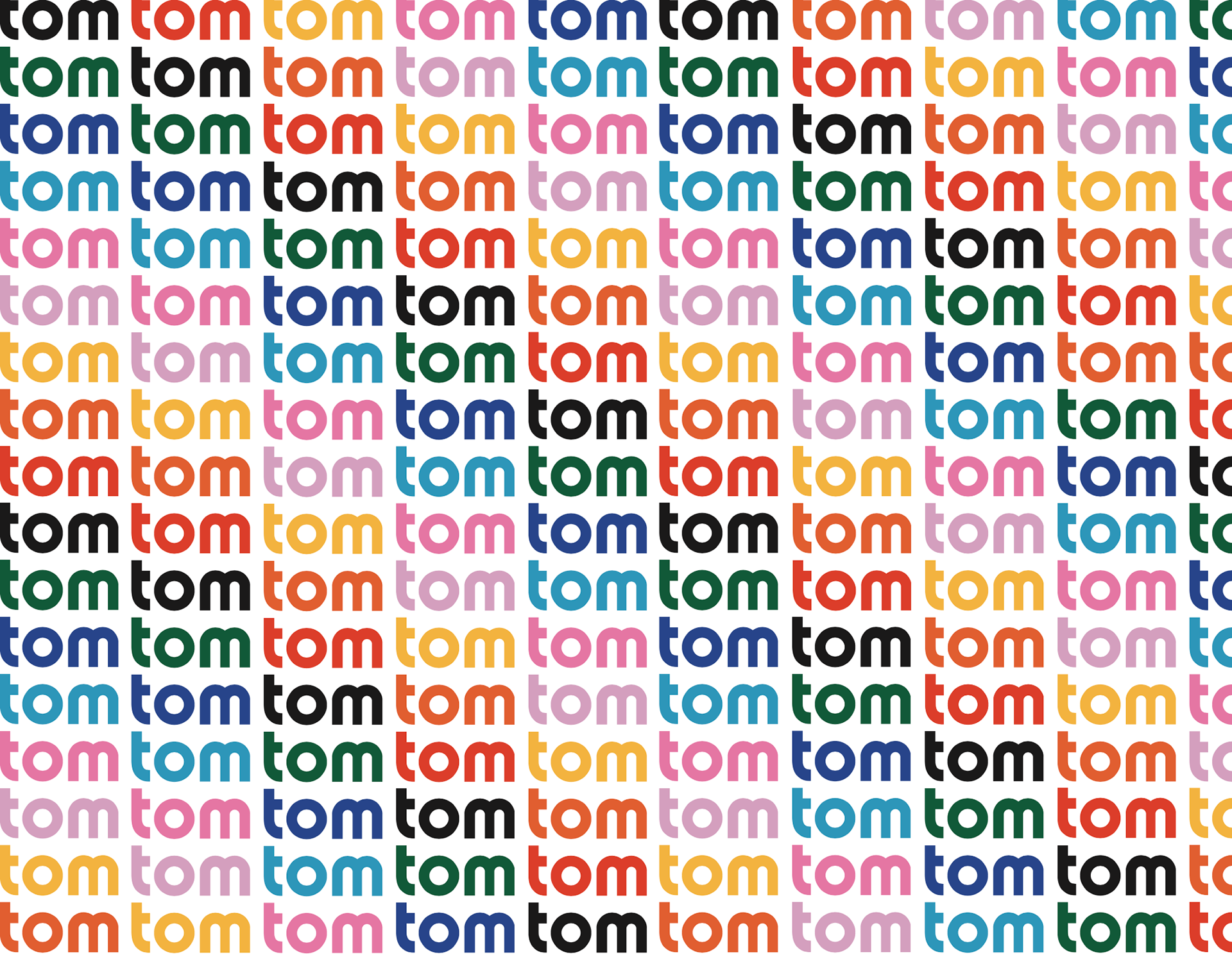
• Presenting a versatile logo with multiple possible applications. This demonstrates evolution, that is: it brings new expertise without letting go of all the years of experience. The idea is to maintain a connection with strong letters but straight fonts; create this connection with the history of the agency.
• Creating a cool personality enhanced by design simplicity and interconnectivity.
• The key aspect for visual identity is the typography articulation and flexibility, accompanied by a graphic set that allows fluid behavior, which adapts to various applications.
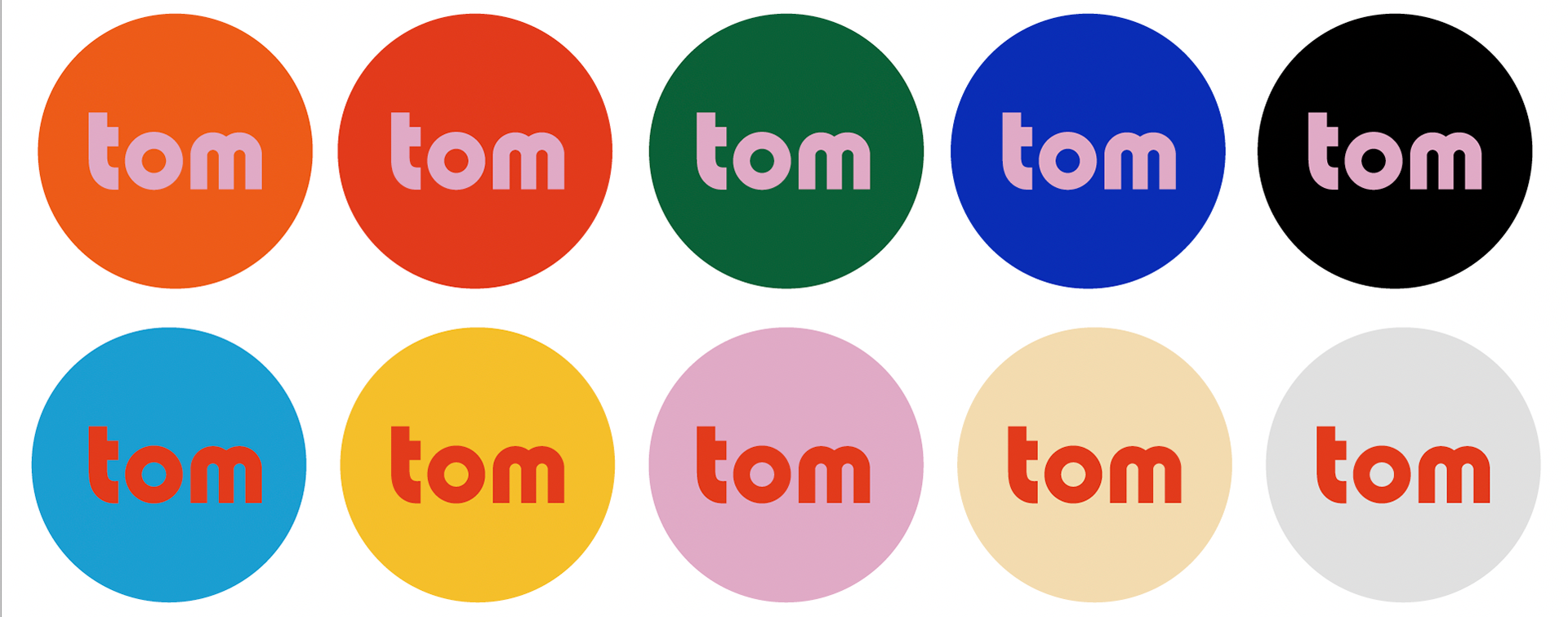
• Focus on vibrant colors and contrasts, representing that which stands out, is energetic and contemporary. This articulation is important to strengthen the speech of a brand that changes, speaks, has humor, is not static, adapts and innovates. Constant change and flexibility are the attributes pursued.

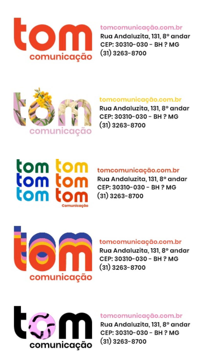
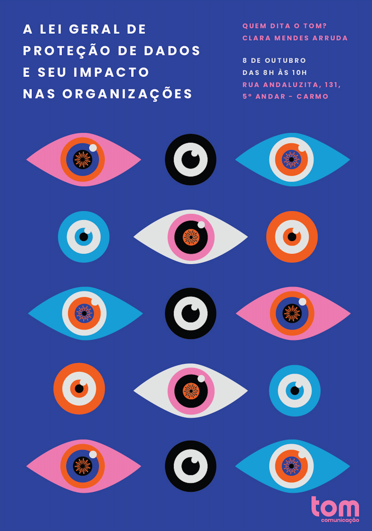
Focus on the circle element:
It brings the idea of continuity, movement and rhythm. It is a basic and extremely dynamic element. Just as the circle can be represented in countless ways, Tom is an agency that adapts to the particularities of each client. In addition, the circular shape represents a cause pursued by the agency: making ideas circulate through a diversity of themes and informed competent people. After all, the best ideas come from continuous exchange.


Credits:
Strategy and Design: Elisa Guilherme
Strategy and Planning: Ingrid Sybele Souza
Creative Direction: Gustavo Leite
CEO: Adriana Machado e Vinícius Alzamora
Strategy and Design: Elisa Guilherme
Strategy and Planning: Ingrid Sybele Souza
Creative Direction: Gustavo Leite
CEO: Adriana Machado e Vinícius Alzamora