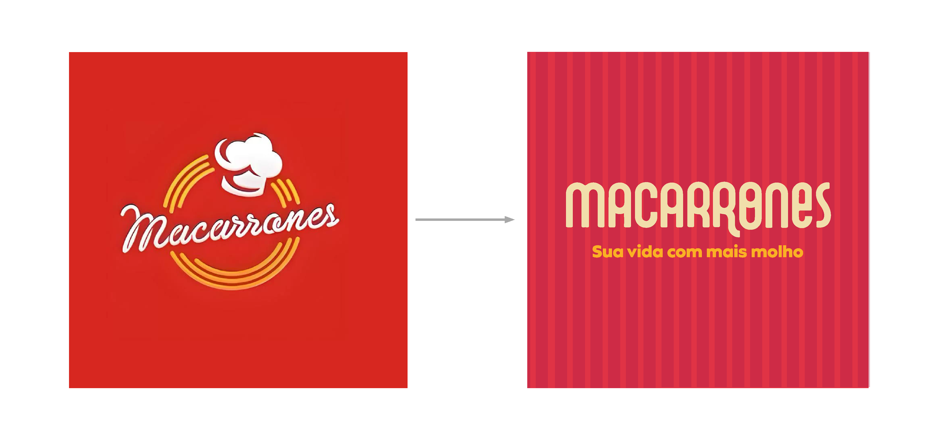
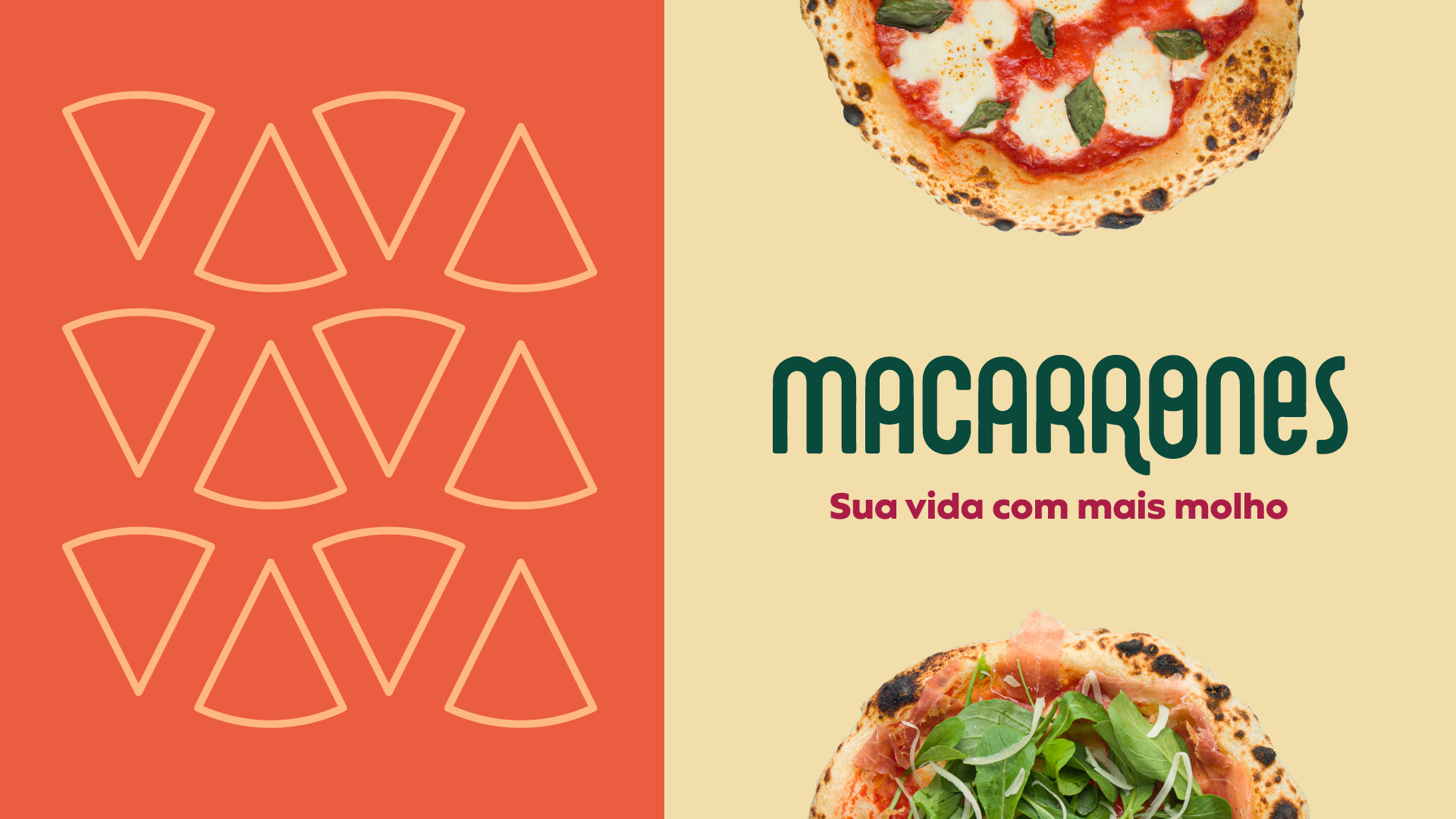
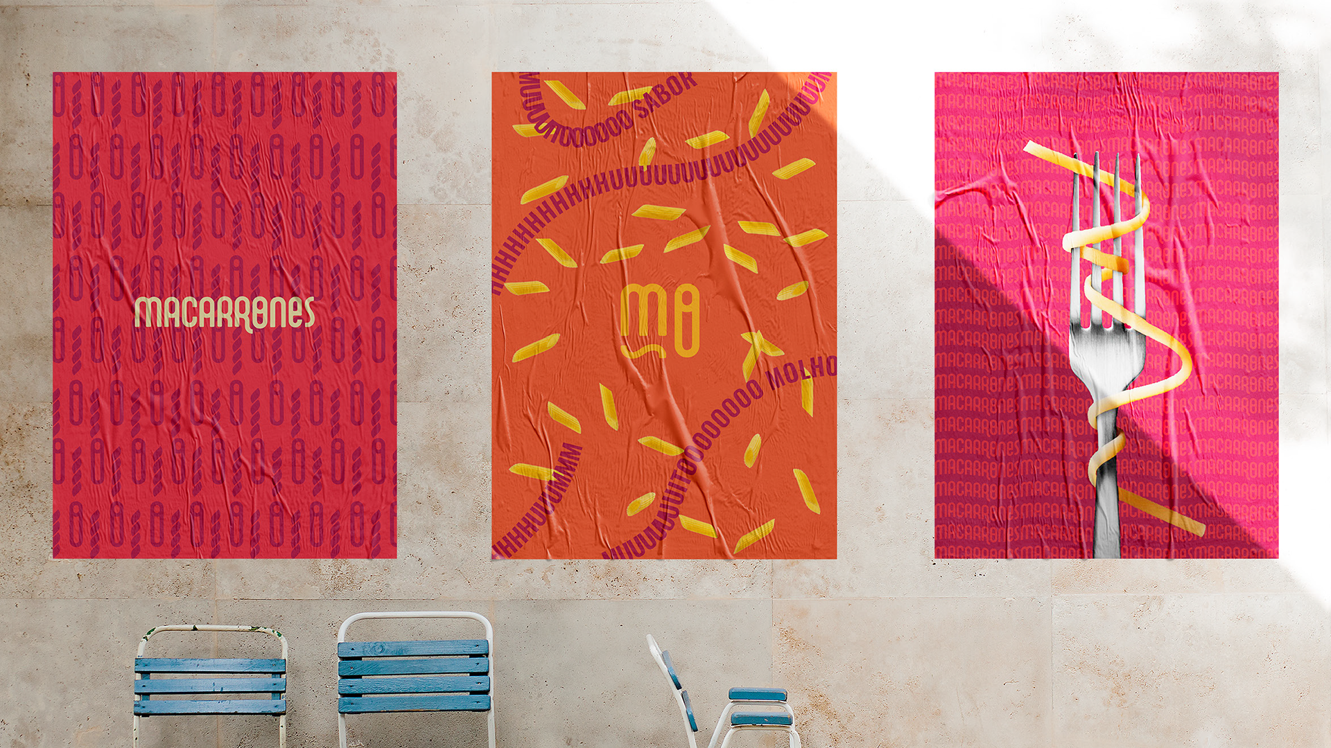
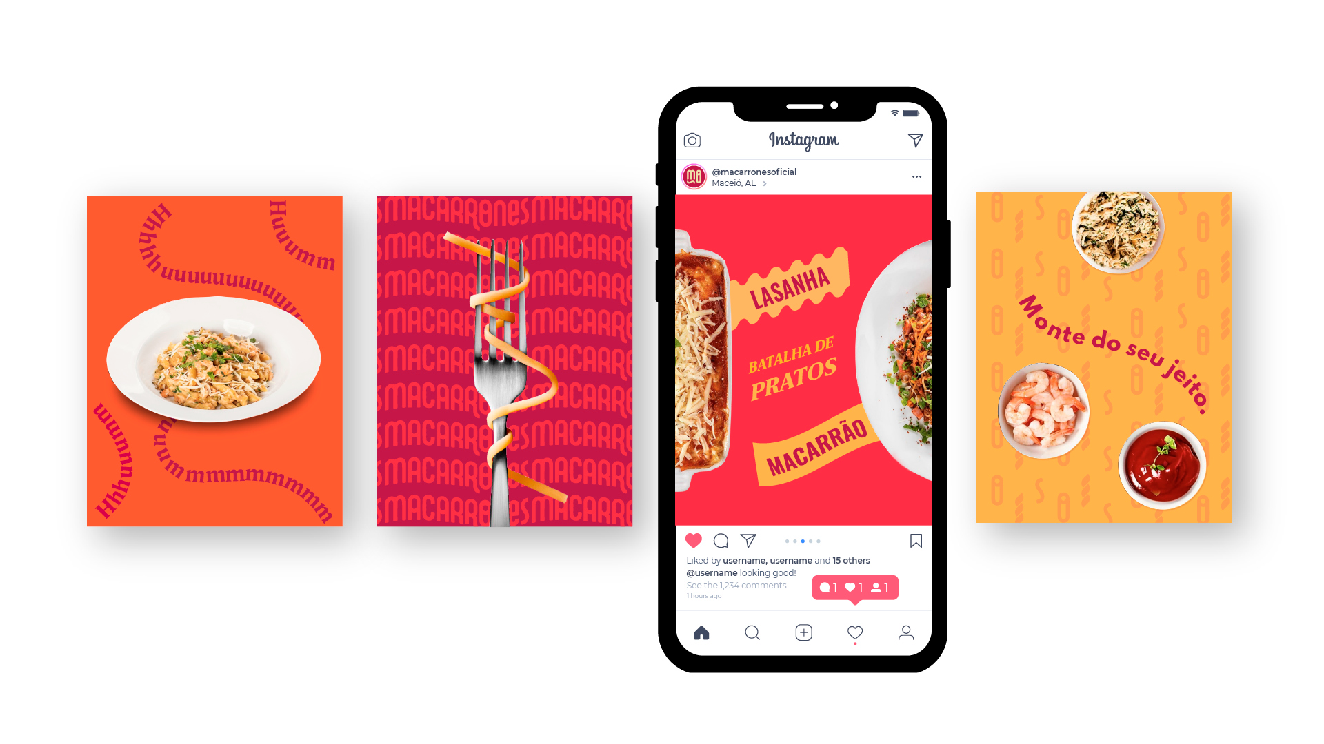
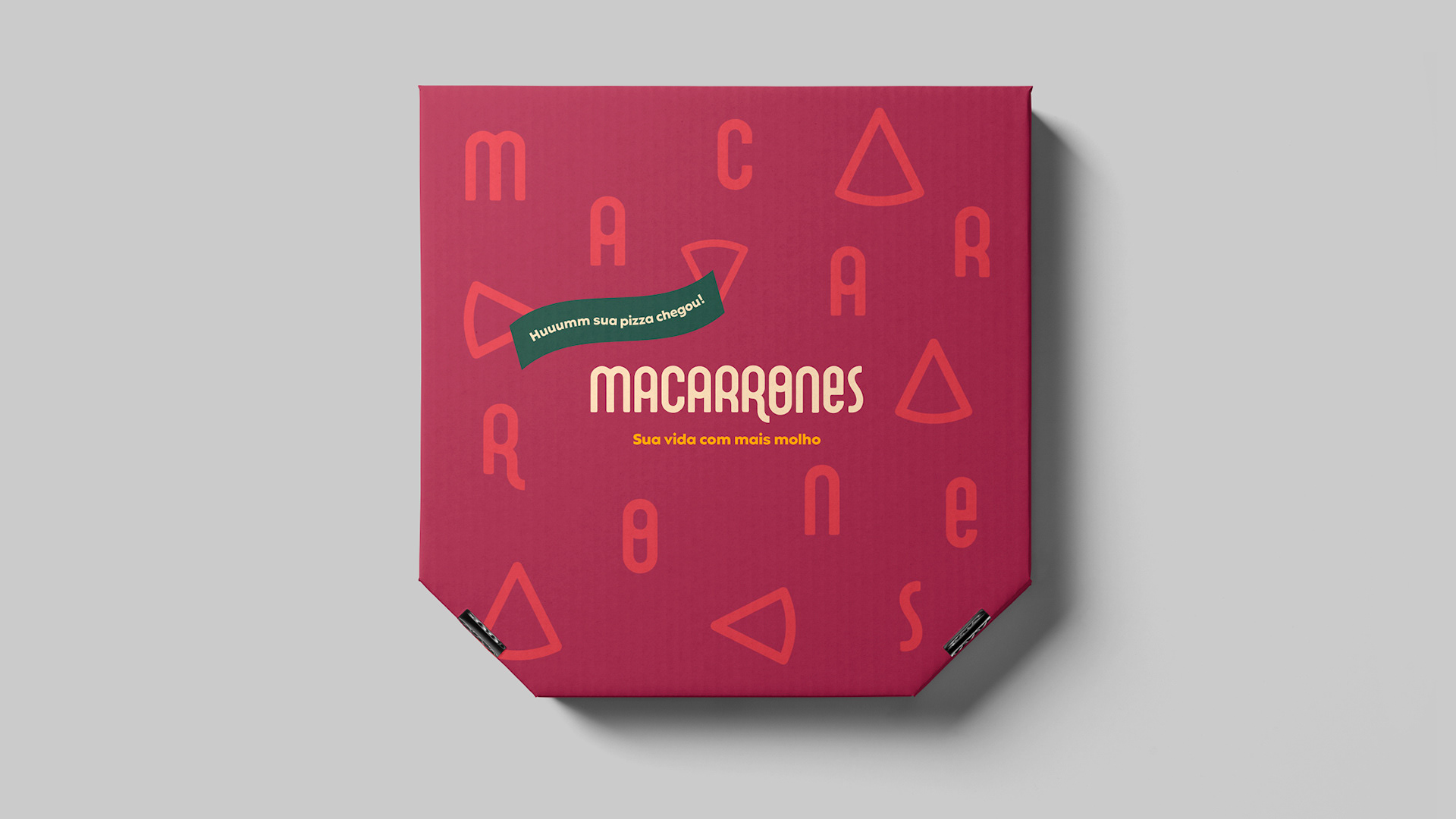
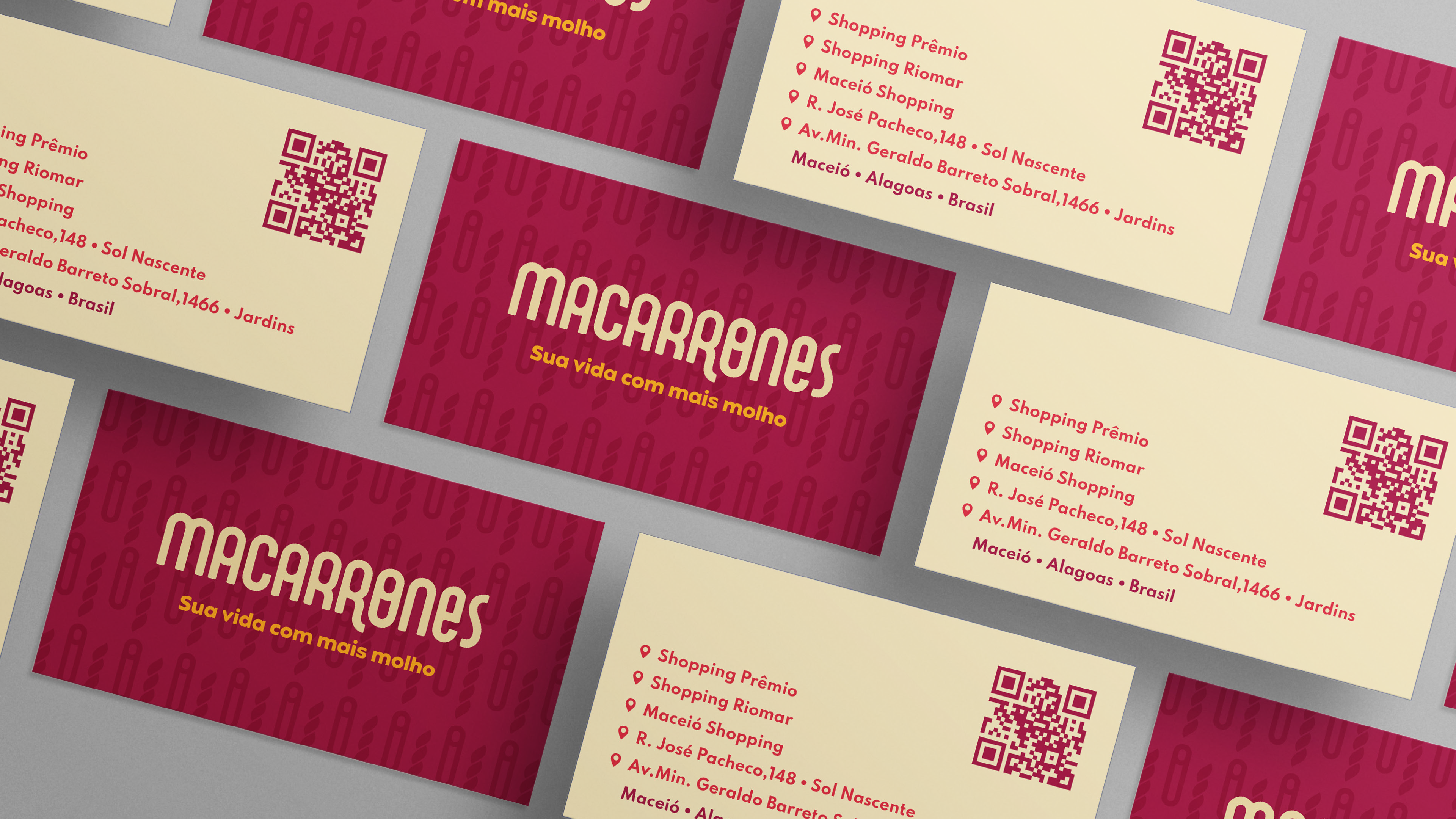
The famous restaurant in the city of Aracaju needed a market repositioning and brand update. The new visual identity was based on the pillars: flavor, diversity and Brazilianness with Italian tradition. (or Italian enhanced Brazilianness)
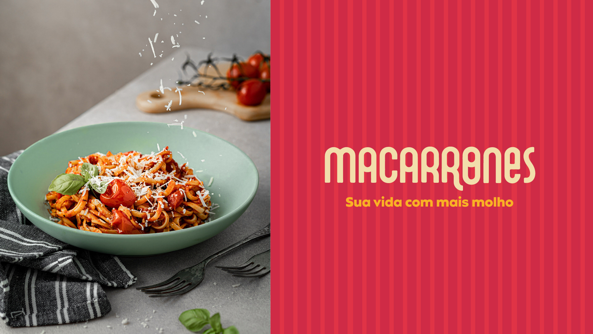
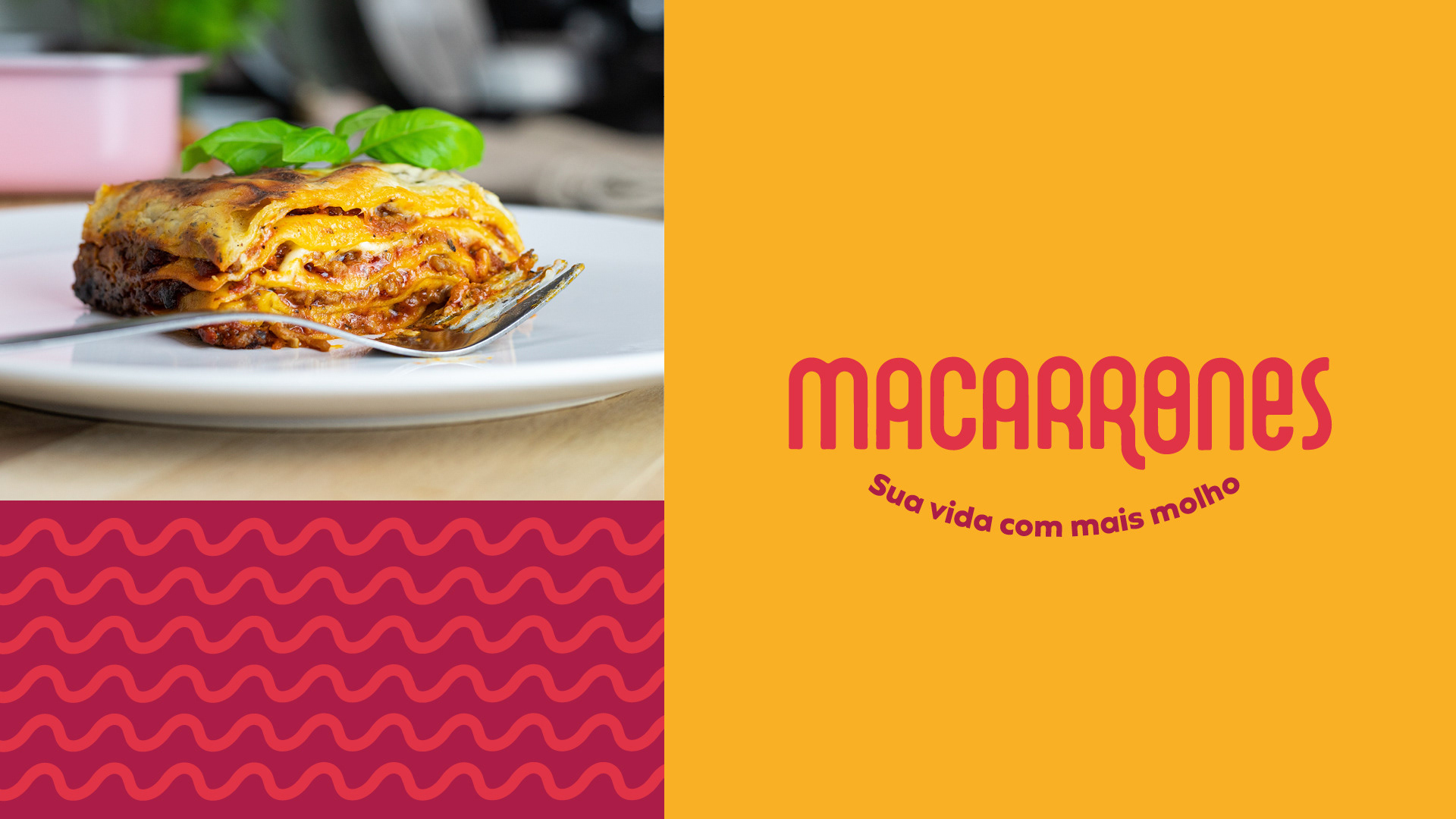
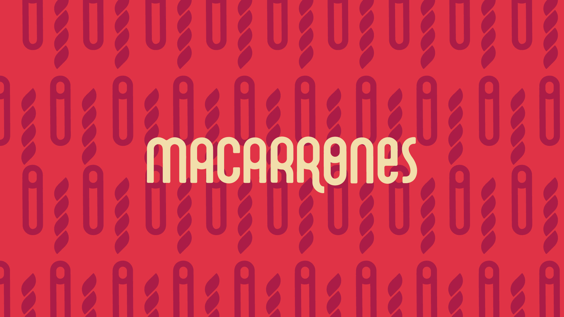
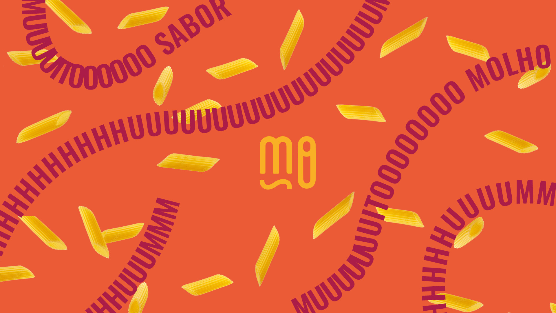
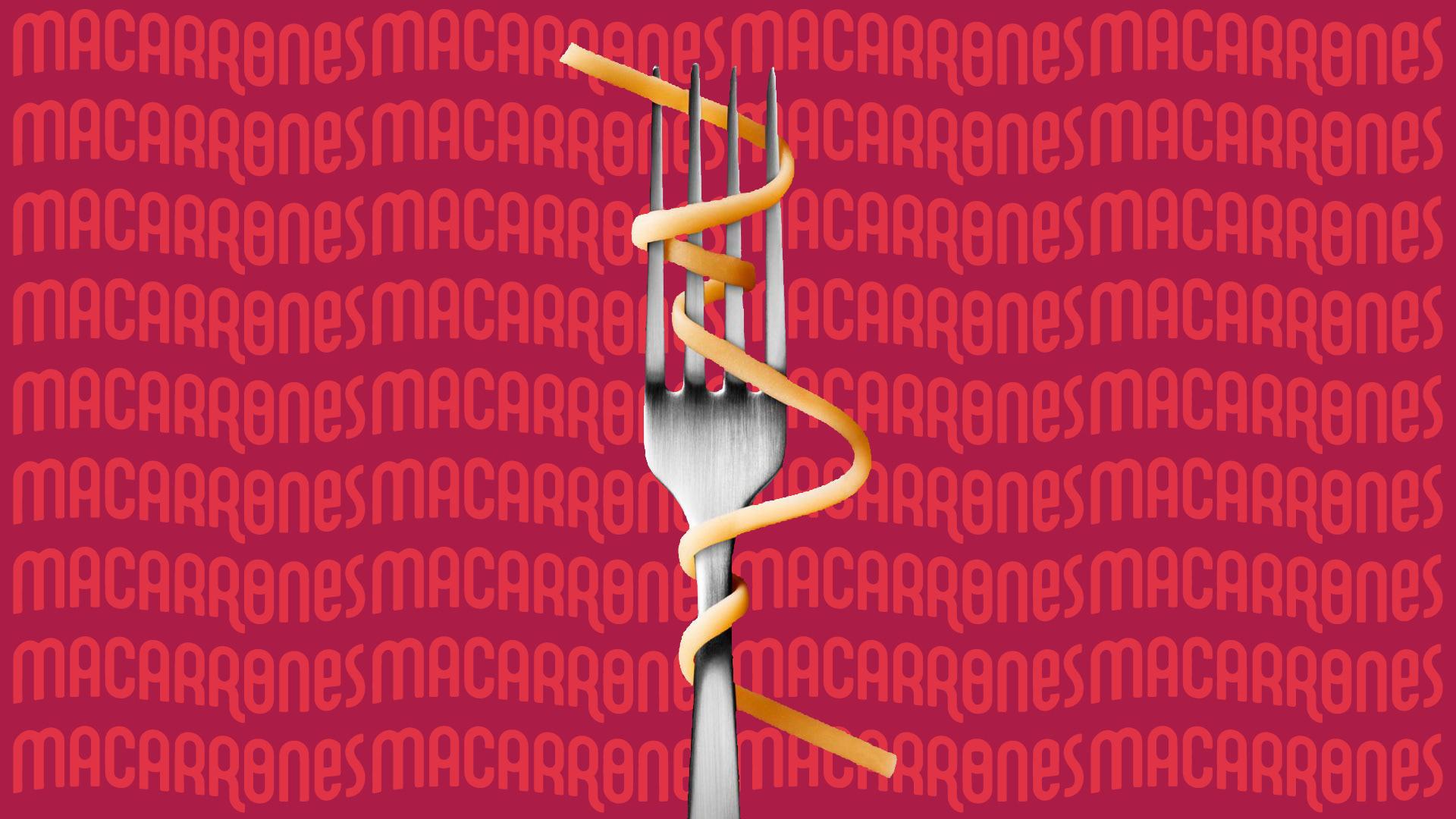
The logo was designed to convey more personality to the brand, making it energetic, innovative, trending and fun. The colors - revisited in new tones, close to the previous ones - evolved, without disconnecting from the credibility built. Furthermore, the color palette was extended to provide a more dynamic communication.
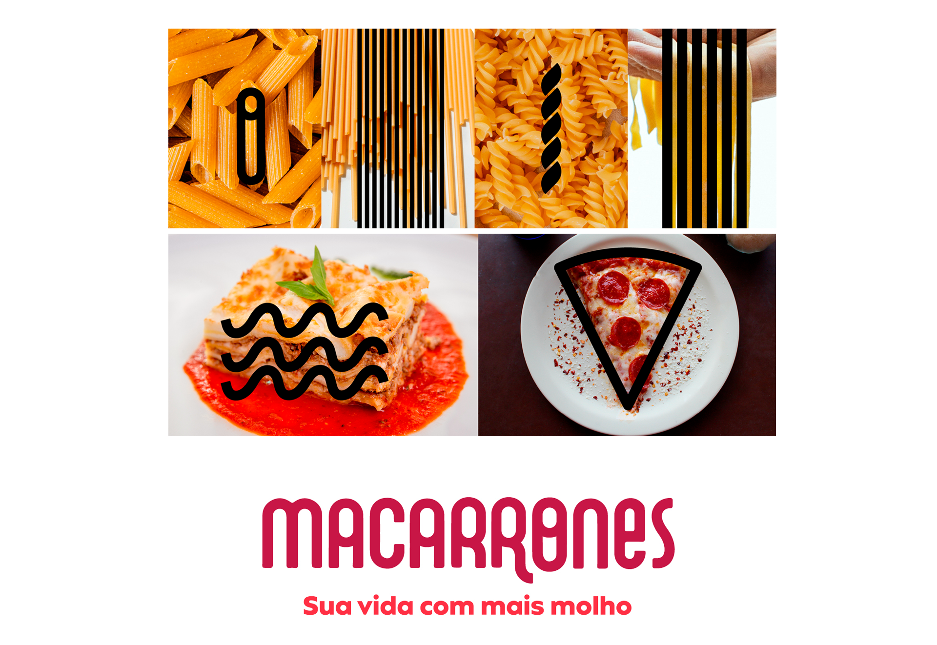
The ingredients were the inspiration for the logo and graphics
Credits:
Agency: Solution Comunicação