Challenge
Develop and translate a new moment for the Olhar Research Institute, based on the definition of a new purpose, values, strategies, in addition to a new and complete visual identity.
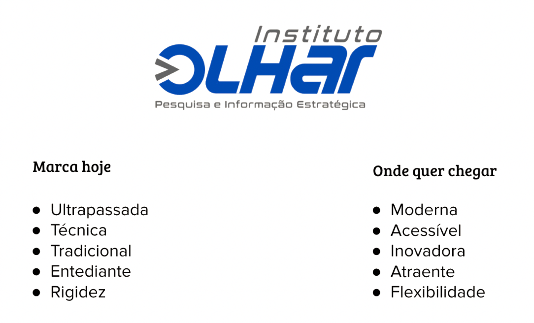
Research revealed that Olhar Institute had a measured, timid positioning, with a culture that was not very innovative. We understood, from the survey and co-creation exercises, that it is not necessary to appear cool to innovate and that there is a clear aspiration, both from the public and customers, for a differentiation in the way the organization is perceived.
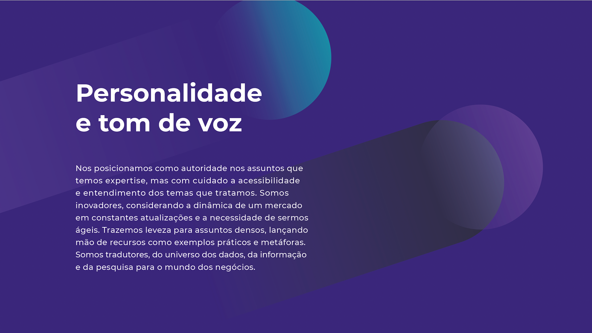
The idea was to arrive at a more open positioning proposal considering “the pride of who you are” (history/tradition), “confidence in what you know” (methodologies) and insert into the brand narrative “the curiosity to approach the new ” (innovation, communication, personality).
Strategy
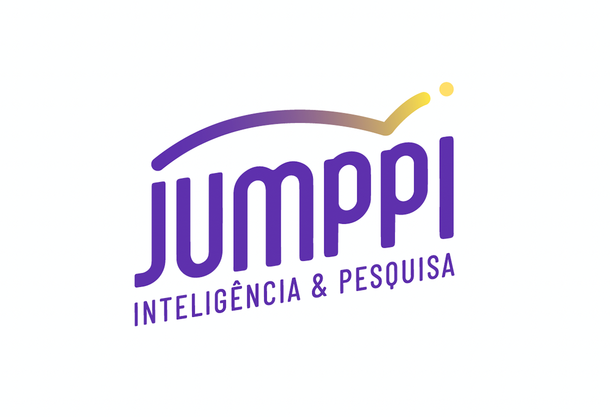
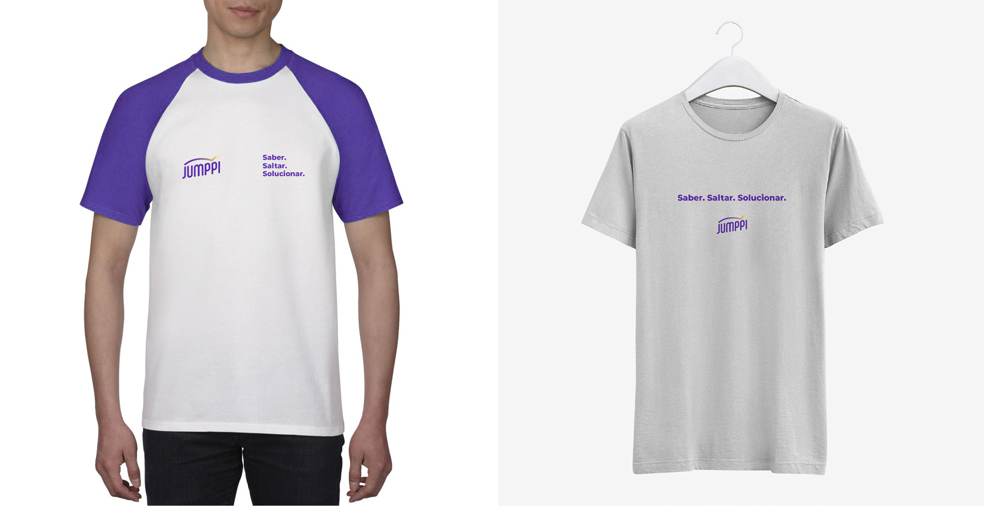
After research and co-creation sprints, we verified the need to recreate the brand. From name to logo. From positioning to values. The new identity needed to reflect the company's current moment: more dynamic and contemporary. From this reflection, the new name emerged: Jumppi. The new positioning: we are innovative, responsible and accessible. And the values: fidelity to the technique, reliability and depth in the research process; always working with truth and transparency; intelligence and innovation focused on results for the client.
Positioning:

Creation
Using a unique typography, created especially for this project, we gave the brand more identity and exclusivity. The font aligned at the same height provides the ideal balance between the elitist and mass characters that this identity must convey, that is, it does not impose itself with capital letters and dense strokes and, also, appears lighter, closer and more accessible without tending to simplism of a common font.
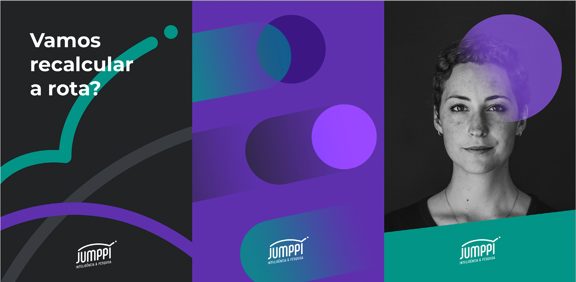
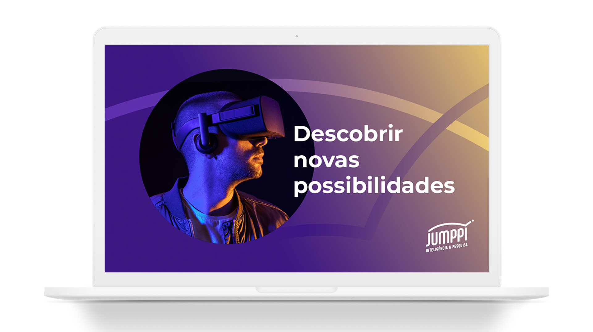
By transforming the graphic mark into a sign that promotes movement, we associate even more meaning to the name and everything it symbolizes. Now, the brand is unbound when visually translating the leap, the future and the different possibilities represented and communicated by the company's new moment.
Furthermore, it carries the visual meaning of the “check” symbol, which is associated with what has been verified, confirmed, proven.
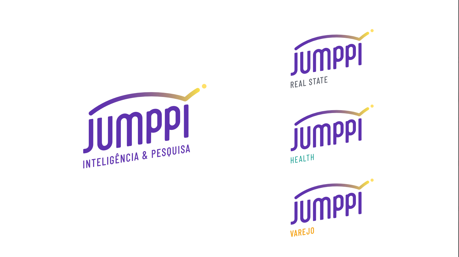
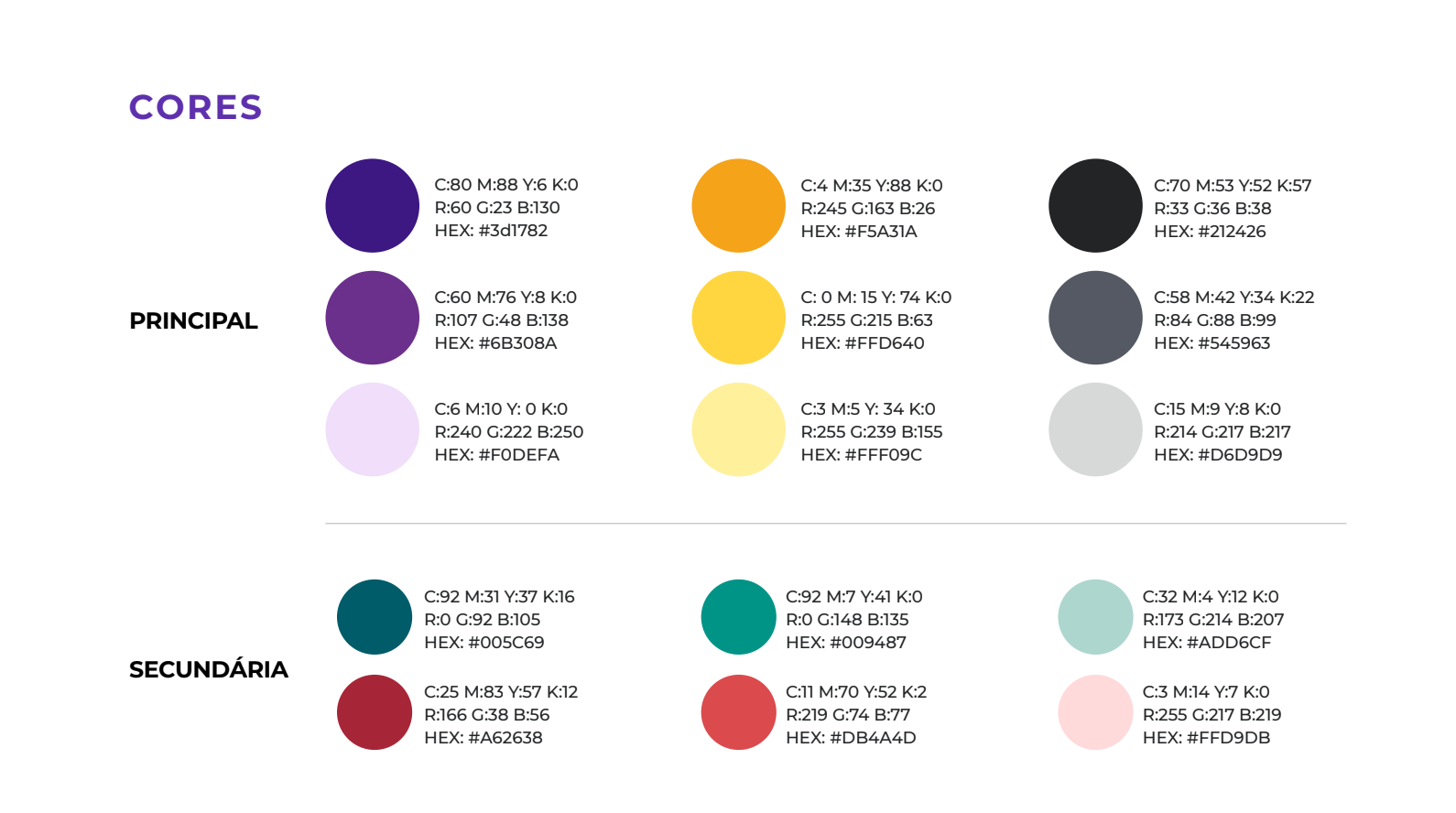
The color palette was strategically chosen to convey lightness and modernity, in addition to positioning and integrating the brand into the business ecosystem to which it belongs, the Matter&CO group. A choice that brings benefits to communication, strengthening its narrative and causing the customer to have a more direct association with the group and Jumppi's potential for action.
Credits:
Strategy and Planning: Tiago Bellote
Copy writing and Research: Sérgio Souto
Design and Strategy co-creation: Elisa Guilherme
Strategy and Planning: Tiago Bellote
Copy writing and Research: Sérgio Souto
Design and Strategy co-creation: Elisa Guilherme