
Challenge:
The Scala cheese and dairy factory is a family company from Minas Gerais, which carries on the Italian tradition that comes from its founder, Mr. Nino. The family holds this tradition, its Minas Gerais roots and values a fair, sustainable and careful production chain.
Scala was losing visibility in the market due to the large number of competitors and needed a repositioning to become relevant and competitive, especially in relation to B2C. It was necessary to identify the purpose, update the positioning and build a strong and loved brand in retail and food service demand.
Research has shown that Scala had several business drivers such as: time of existence/tradition, quality, product variety and attention to ESG parameters. On the other hand, distribution proved to be limited, communication was weak, and neither visual identity nor packaging stood out in the market.
Old Layouts:

Strategy:
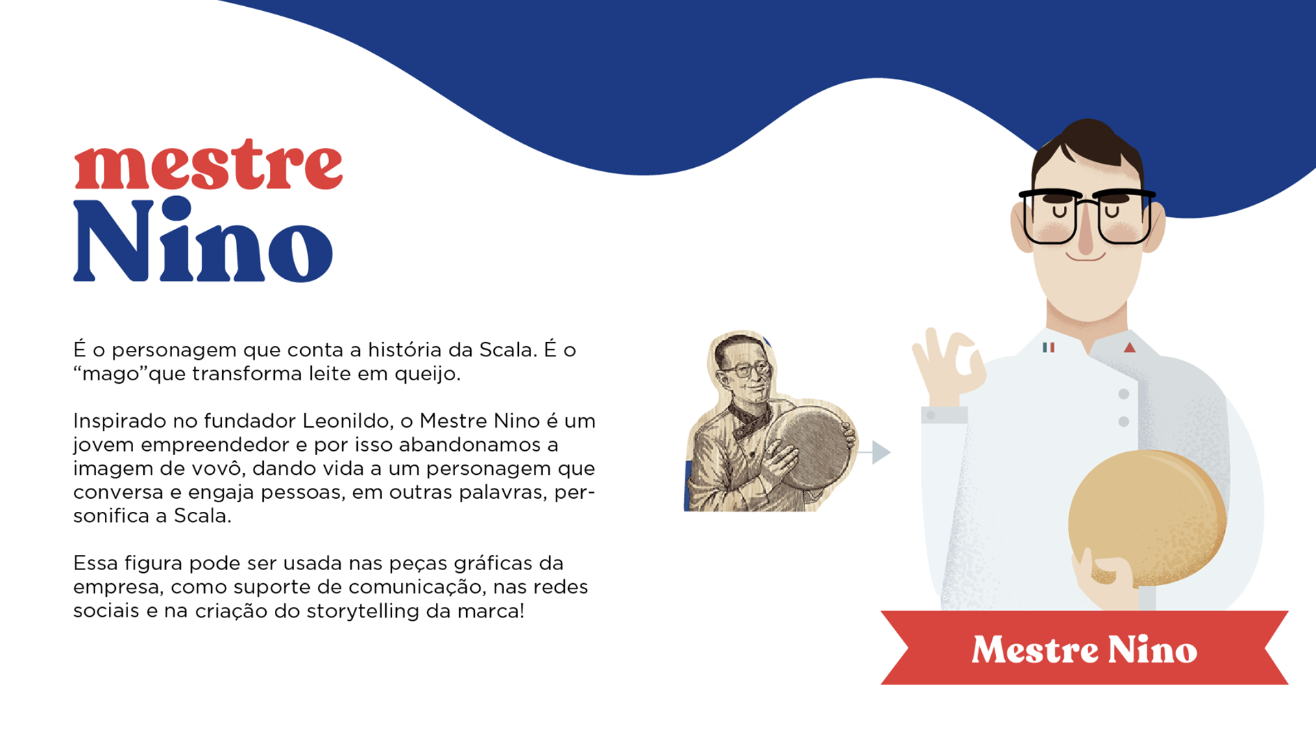
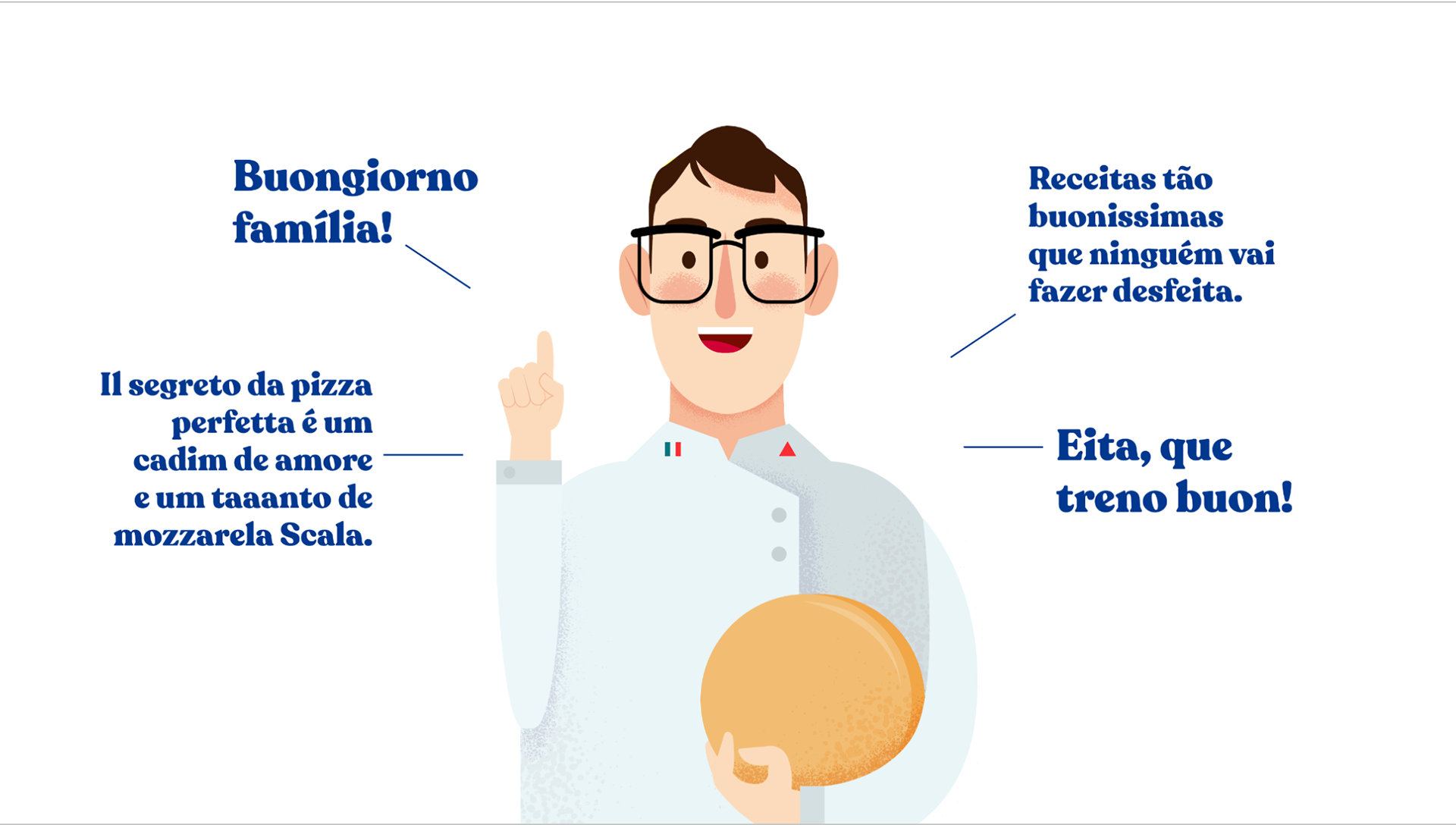
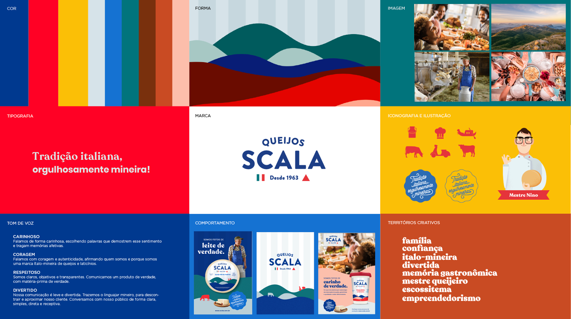
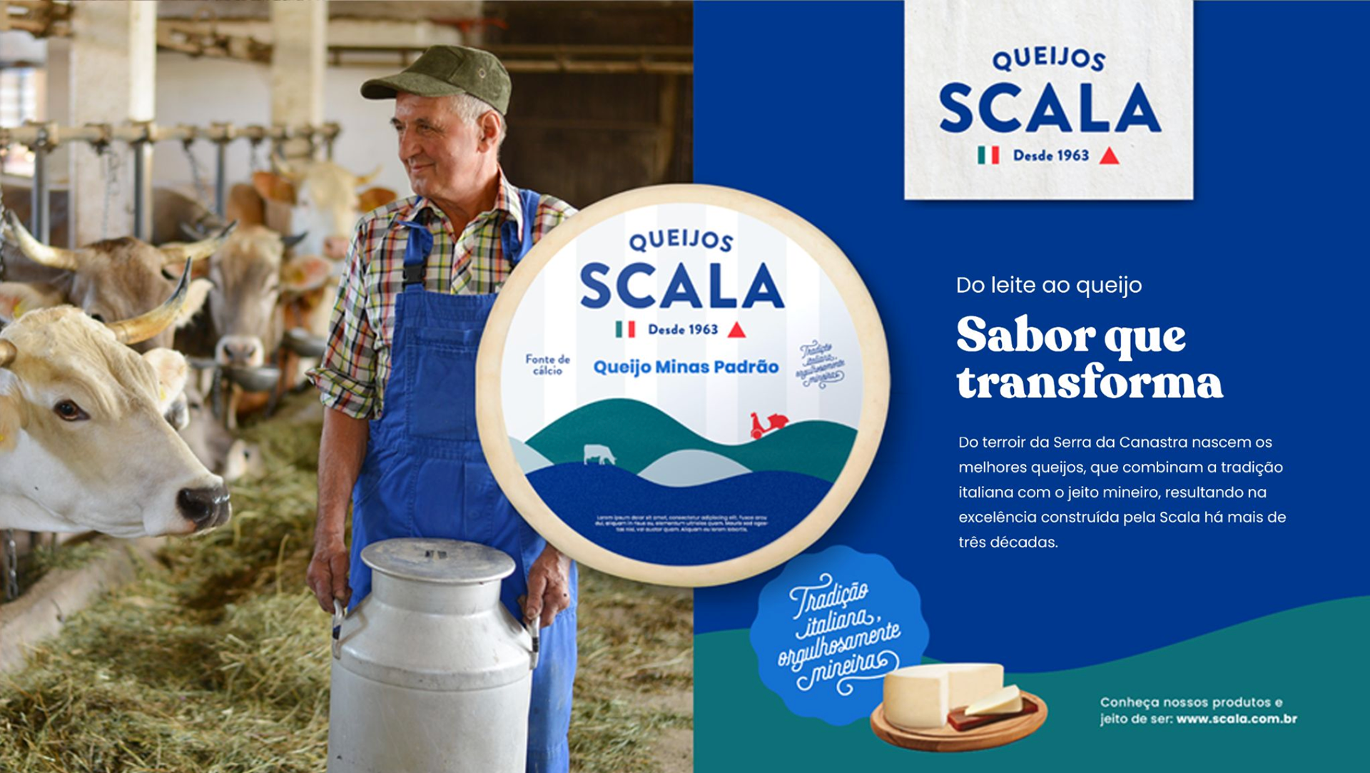
Based on in-depth research and analysis, the adopted strategy consisted of repositioning the brand in order to highlight the entrepreneurship of its founder, Nino. This was accomplished through fun and charming storytelling, which connected the founder's Italian heritage to his significant presence in Minas Gerais.
Besides, it was necessary to improve the experience of B2C customers. This involved expanding distribution and, most importantly, improving communication. The strategy to achieve these goals included strengthening the digital and POS presence, which increased the visibility of products and brand.Scala's DNA has been reformulated. Personality attributes such as fun, authentic, affectionate and entrepreneurial were defined. The added values were: tradition, excellence in production, respect for the entire ecosystem and simplicity. The wizard archetype represents visionary, innovative, charismatic thinking with the power to transform. Transform simple ingredients into high-quality products. Transform flavor into good moments with family and friends.
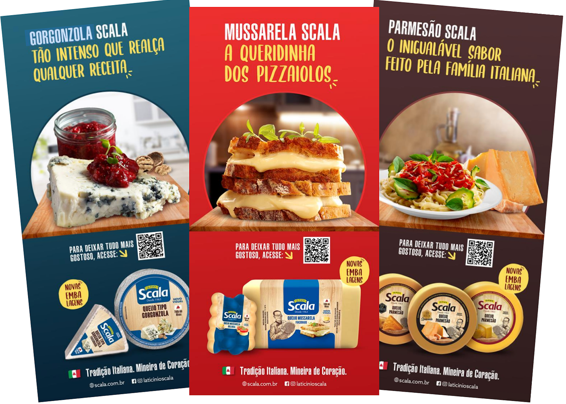
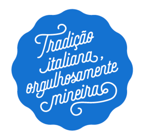
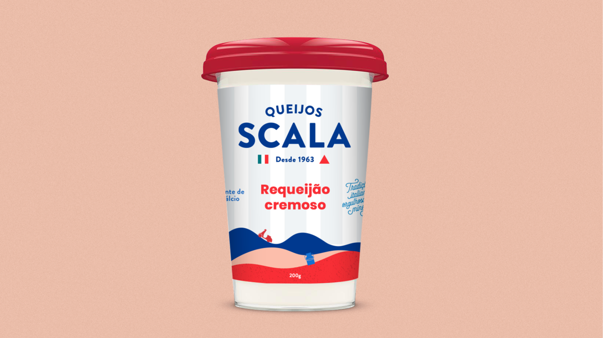
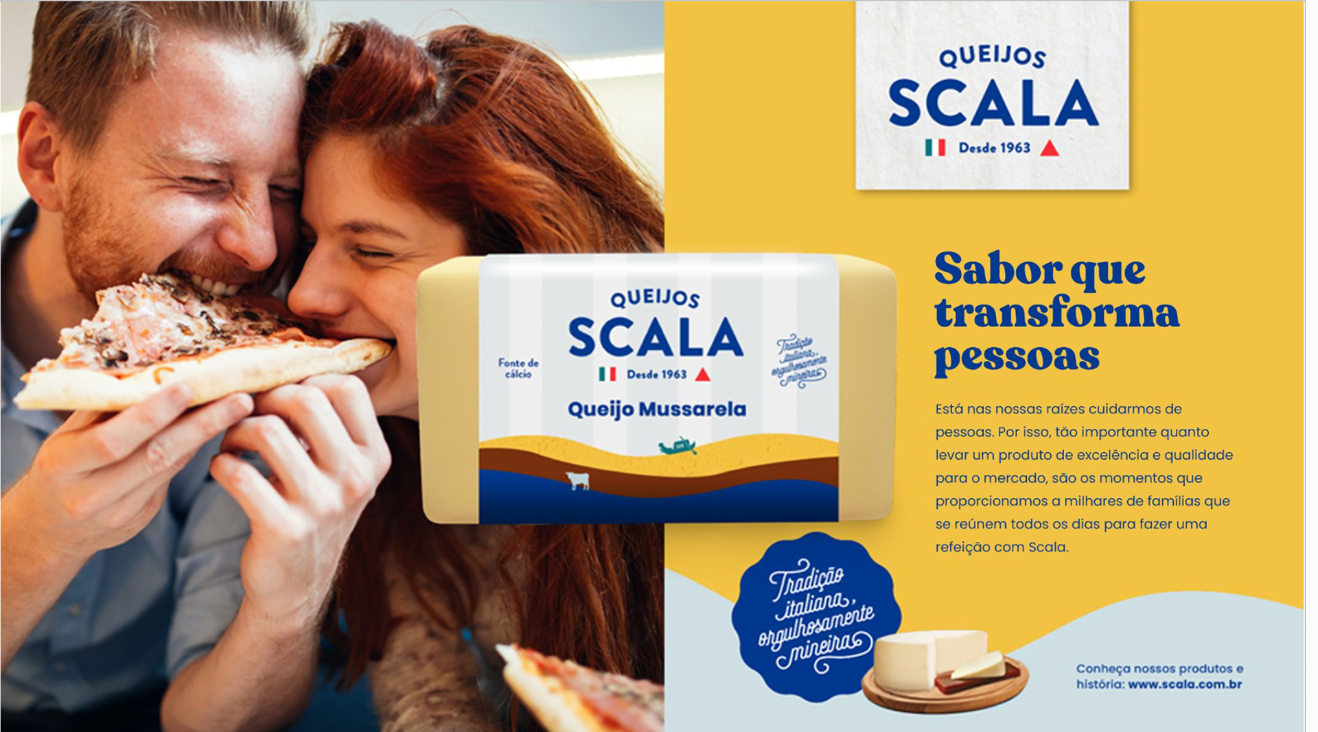
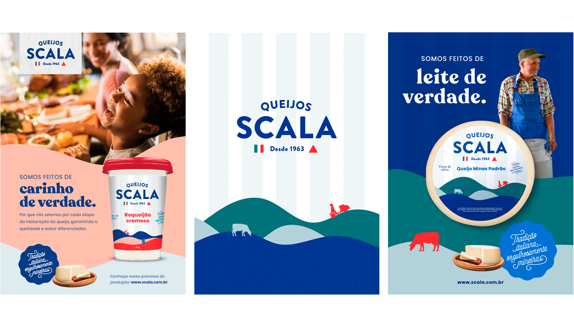
To express the new positioning, the tagline “Italian tradition, proudly from Minas Gerais” was created, which, applied in the form of a stamp (or logo), reinforces the values of excellence and quality.
Creation
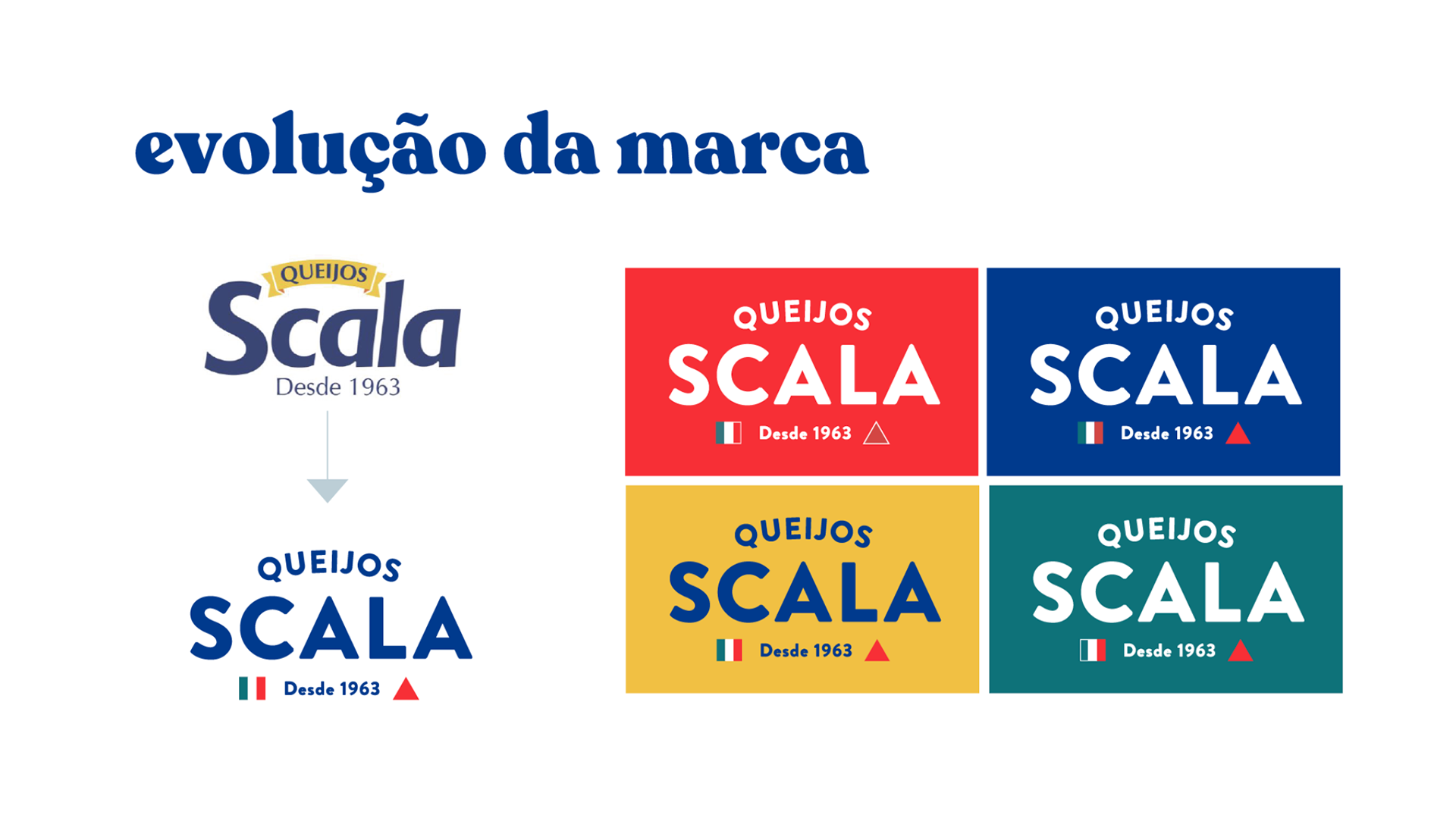
The brand also needed to be reformulated, as it was outdated.
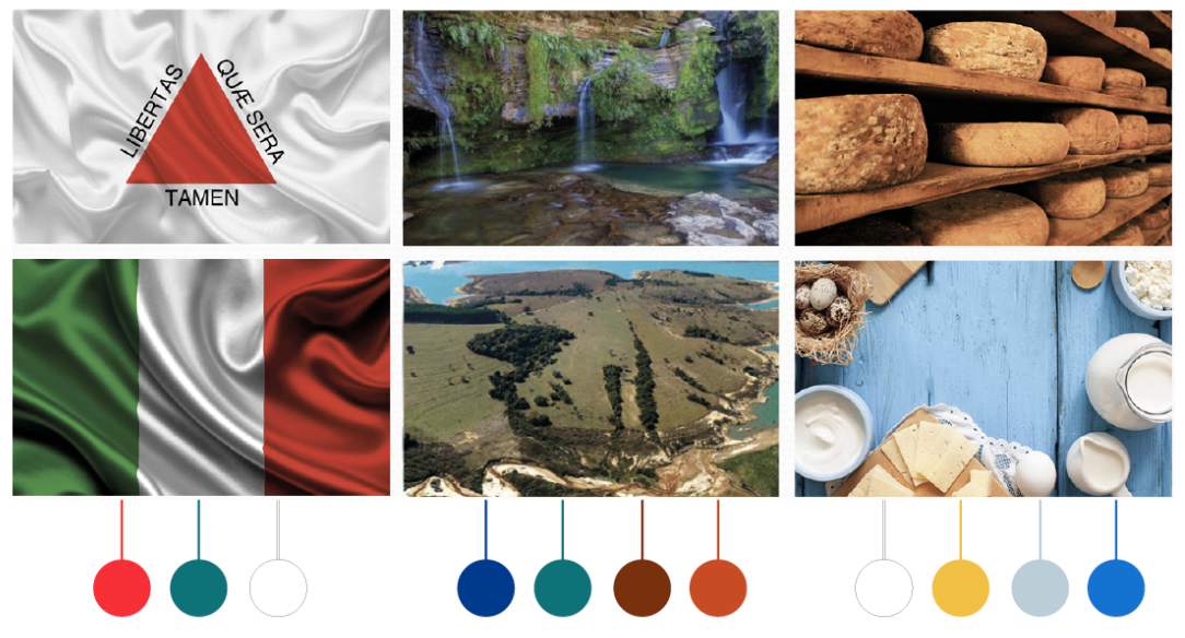
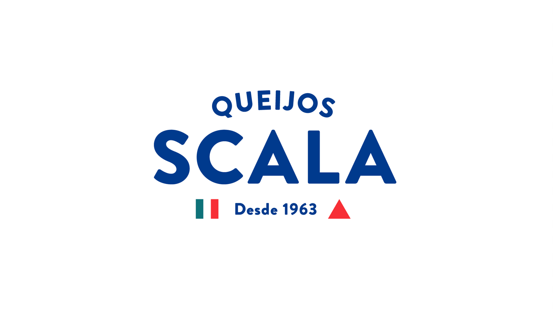
To personalize the logo and convey an important value of the company - Italian descent on Minas Gerais soil - the flags of Italy and Minas Gerais were used, which also inspired the colors palette.
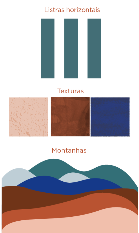
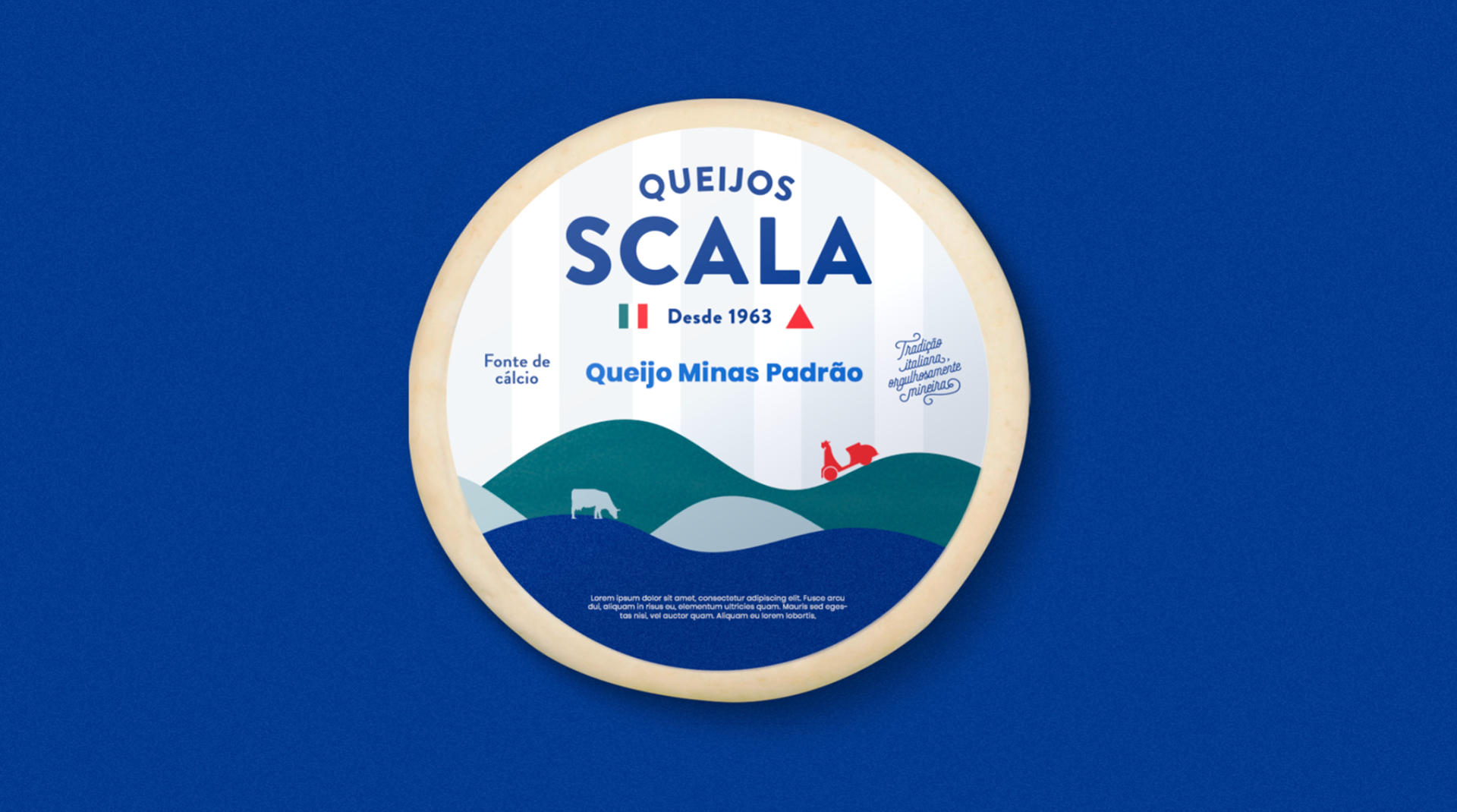
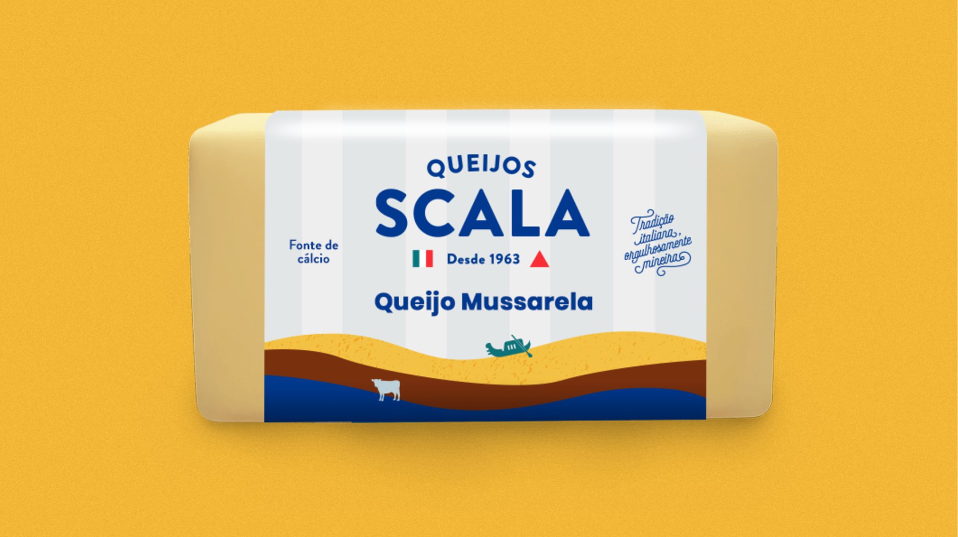
It was still necessary to stand out from the countless competitors, so we used design as a tool to enhance and differentiate our visual identity. We sought to modernize old tones, making them more open and lively. The organic shapes and textures brought the idea of artisanal quality, the waves came in as a reference to Minas Gerais “hilly seas” and the vertical stripes, to allude to the characteristic stripes of the Italian flag.
The entire visual universe is based on the principle of union of two cultures. By uniting all forms, we guarantee modernity and fluidity in a unique and differentiated communication. The chosen images convey welcoming, belonging, care and lightness and the foods were inserted in moments of consumption around the table and in environments of joy and relaxation.
Credits:
Strategy, Planning, Content:
Ana Catarina P. Barusco, Briana Manzan Reis , Bruno Betini, Elisa Guilherme, Emilie Morais, Katia Sala, Leonardo Gama,
Lucas Bueno, Yago Laport, Queli Forgiarini
Design: Elisa Guilherme